How to Improve Ecommerce Conversion Rates: A Practical Guide
If you're trying to improve your ecommerce conversion rates, you have to get past the generic advice and start digging into your own data, user experience, and technical setup. It’s about diagnosing what’s really holding your store back and making changes that actually move the needle on your revenue.
Moving Beyond Best Practices to Real Results
Have you followed all the standard advice on how to improve ecommerce conversion rates, only to see your sales numbers stay disappointingly flat? You’re not alone. Many store owners get caught in a loop, adding trust badges or tweaking their navigation because a blog post told them to, but they see little to no real impact.
This happens because generic advice doesn't—and can't—address the specific friction points that are unique to your audience and their journey through your store. Real conversion rate optimization isn't about ticking boxes on a checklist of popular tactics. It's a disciplined process of discovery, hypothesis, and validation.
A Framework for Tangible Growth
To see meaningful growth, you need to look at your store as a complete customer experience, not just a collection of pages. This means shifting your focus from quick, surface-level fixes to a much deeper, more strategic approach.
This whole process really boils down to three core pillars:
- Deep Data Analysis: Stop guessing. Use your analytics to find out exactly where people are dropping off and form educated hypotheses about why.
- User-Centric Design: Get inside your users' heads. Your goal is to create a shopping experience that feels intuitive, persuasive, and completely trustworthy.
- Strategic Technical Improvements: Eliminate the technical roadblocks that kill conversions. This means optimizing for site speed, mobile experience, and a seamless checkout process.
This infographic breaks down the shift from simply applying best practices to adopting a truly results-driven optimization strategy.
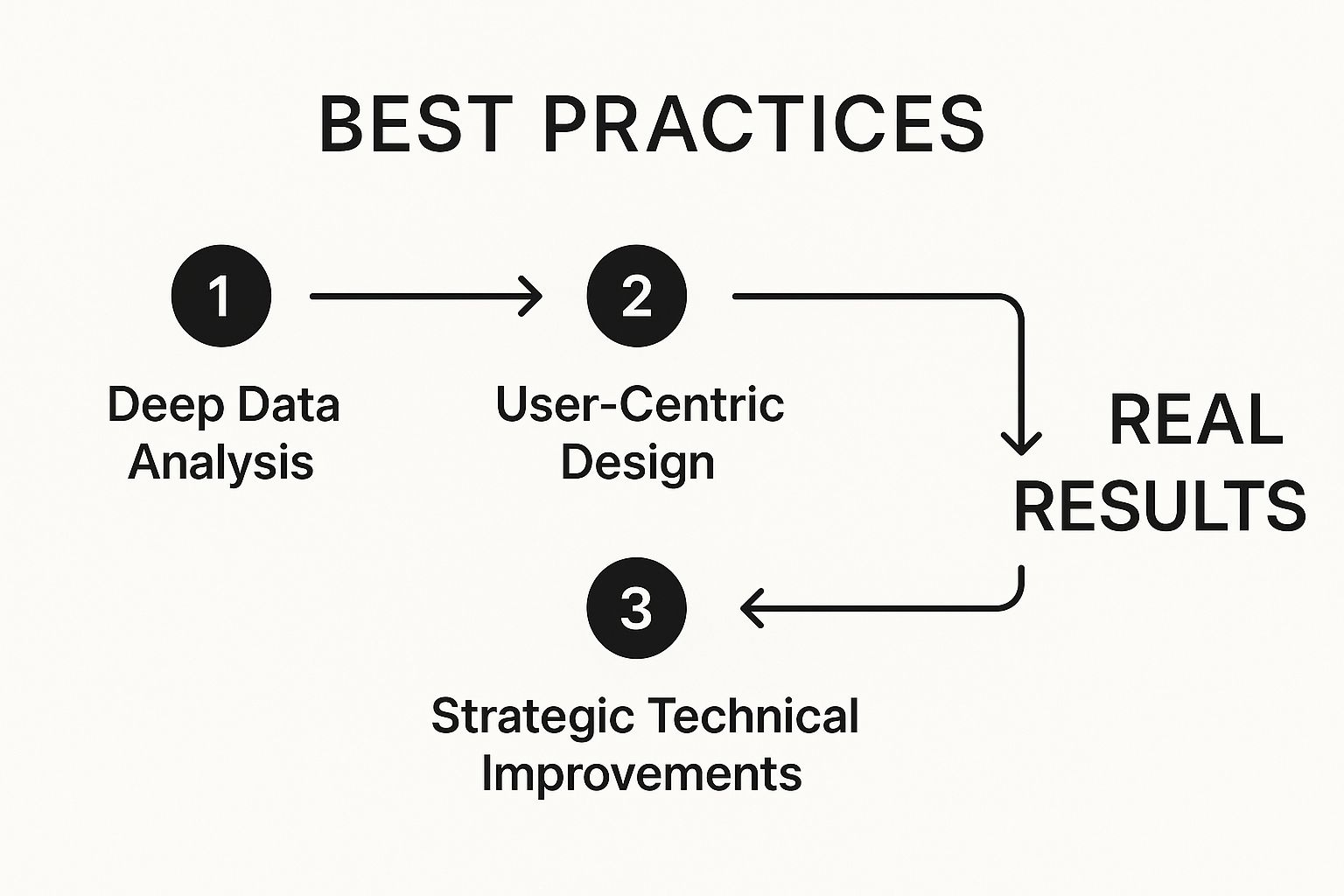
As you can see, sustainable growth comes from a methodical process, not just throwing random fixes at the wall and hoping something sticks.
To help frame our approach throughout this guide, let's summarize these foundational concepts.
Core Pillars of High-Converting Ecommerce Stores
| Pillar | Key Focus | Common Pitfall to Avoid |
|---|---|---|
| Deep Data Analysis | Identifying user drop-off points and conversion leaks using analytics. | Making changes based on assumptions or what competitors are doing. |
| User-Centric Design | Creating an intuitive, seamless, and trustworthy user journey. | Prioritizing aesthetics over usability and clarity. |
| Strategic Technical Improvements | Removing technical barriers like slow page speed and buggy checkouts. | Neglecting the mobile experience, where most users shop today. |
Each pillar is a critical component of a successful optimization strategy. Focusing on these areas ensures you're addressing the root causes of poor conversion, not just the symptoms.
Why Common Advice Often Fails
The internet is overflowing with ecommerce advice that sounds great but doesn't deliver. A competitor might have great success with aggressive pop-ups, but for your specific audience, that same tactic could come across as desperate and damage your brand's credibility.
The secret is to stop chasing universal "solutions" and start diagnosing your store's specific problems. A high-converting store is built on a deep understanding of its own data and its own customers—not on what's trending.
Every single part of your store—from how a customer first discovers a product to that final click on the "Complete Purchase" button—plays a role in your conversion rate. For a deeper dive into turning visitors into loyal customers, you can explore these actionable strategies to improve website conversion rates for every stage of the funnel.
In the rest of this guide, we’ll break this entire framework down into practical, step-by-step actions you can take to see real, measurable improvements in your store’s performance.
Finding the Leaks in Your Sales Funnel
To really move the needle on your conversion rates, you have to think like a detective. Forget guessing what might be wrong. Your first job is to dig into the data and find the exact spots where you're losing customers. This isn't about staring at dashboards until your eyes glaze over; it's a focused investigation to plug the leaks in your sales funnel.

Imagine your website is a physical store. Are people walking out after just glancing at one aisle? Are they ditching a full shopping cart right at the checkout counter? Tools like Google Analytics 4 (GA4) are your security cameras, showing you precisely where the friction is happening.
Start With a High-Level Snapshot
Before you get lost in the weeds, you need a baseline. Look at your main conversion rate—the percentage of visitors who actually complete a purchase. Don't panic if the number feels low. It's just a starting point, giving you the context you need for the real investigation.
It's also important to remember that a "good" conversion rate is all relative. What’s great for one industry might be terrible for another. For instance, personal care products can see conversion rates as high as 6.8%, while home decor often hovers around a much lower 1.4%. You can see how different industries compare on Network Solutions to get a better feel for where you stand. The real goal isn't to hit some arbitrary average, but to consistently beat your own numbers month over month.
Pinpoint Where Customers Are Dropping Off
Once you have your baseline, it's time to trace the customer's steps. This is where GA4’s funnel exploration reports become your best friend. They let you visualize the entire journey, from the moment someone lands on your site to the final purchase confirmation. More importantly, they show you exactly where people are bailing.
Here’s a practical way to break it down:
- Map out your ideal customer journey. It usually looks something like this: Homepage → Category Page → Product Page → Add to Cart → Checkout → Purchase.
- Build that funnel in your analytics tool. The report will immediately reveal the percentage of users who make it from one step to the next, and the percentage who drop off at each stage.
- Find the biggest leaks. Look for the most dramatic percentage drop between two steps. A massive drop-off between the product page and adding to the cart is a totally different problem than a high abandonment rate during the final payment step.
Don’t just look at the numbers; you need to interpret the behavior behind them. A high exit rate on product pages could mean your photos are blurry or your descriptions are uninspired. A big drop during checkout almost always points to friction, like surprise shipping costs or a clunky form.
Turn Data Into Actionable Guesses
Once you've found a major leak—let's say a ton of people are abandoning their carts—the next step is to form a hypothesis about why. This is how you turn raw data into a real, data-backed optimization strategy.
For example, a 75% drop-off between the "Add to Cart" and "Begin Checkout" stages is a massive red flag. It's a critical bottleneck, but it's also a common one. If you're seeing this, our guide on how to reduce cart abandonment has some specific tactics you can try.
Let’s look at a few common scenarios and the educated guesses you could make.
| Data Point | What Might Be Wrong (The "Why") | What You Can Test (The Hypothesis) |
|---|---|---|
| High bounce rate on product pages | The product photos are low-quality or the descriptions are weak. | "Adding high-res images and a product video will boost engagement and increase the add-to-cart rate." |
| Low click-through from category to product | Product thumbnails are unappealing or the filters are confusing. | "Making our category filters simpler and more intuitive will help people find what they want, leading to more clicks." |
| High drop-off at the shipping step | Unexpected shipping costs are scaring people away at the last minute. | "Showing a shipping cost estimator on the cart page will reduce sticker shock and lower checkout abandonment." |
This structured process gets you out of the habit of making random changes and hoping for the best. Instead, you're running targeted experiments designed to fix specific, diagnosed problems. This is the foundation of any effective conversion rate optimization strategy.
Crafting an Irresistible Shopping Experience

Before a customer even thinks about adding something to their cart, they're forming an impression of your store. It's an instant gut check based on how your site looks, feels, and works. A confusing or clunky experience sends them straight to a competitor. A seamless one builds the confidence they need to actually pull the trigger and make a purchase.
This is where you turn casual browsers into motivated buyers.
The entire journey, from the moment they land on your homepage to when they’re staring at a product, needs to feel effortless. If a visitor has to work hard just to find what they're looking for, you’ve already lost them. Your job is to reduce their cognitive load—that's the mental energy it takes to use your site—so that clicking forward feels like the most natural thing in the world.
Make Product Discovery a Breeze
A visitor's first stop is usually your navigation menu or search bar. Getting this right is absolutely fundamental because it directly controls how quickly someone can find a product they might want to buy.
A great site search isn't just a box in the header; it's a smart, helpful guide.
- Engaging hint text: Don't leave the search box blank. A simple prompt like, "What are you looking for?" encourages people to use it.
- Smart autocomplete: As someone types, your search should suggest relevant products and categories in real-time. This is a game-changer. It speeds things up and, just as importantly, prevents the frustration that comes from typos.
- Personalized results: If you can, show recommendations based on a user's browsing history or past purchases. It makes the whole experience feel like it was designed just for them.
The same idea applies to your category structure. Keep your main menu clean and don't overwhelm shoppers with too many options. Use logical subcategories and breadcrumbs so users always know where they are and how to get back.
The Anatomy of a High-Converting Product Page
The product page is the moment of truth. This is where the final "yes" or "no" decision happens. Think of it as your digital sales pitch, and every single element has to work together to build desire and squash any doubt.
Here’s a breakdown of what makes a product page truly persuasive:
- High-Quality Visuals: Shoppers can't touch or feel your product, so your images have to do all the heavy lifting. Use professional, high-resolution photos from multiple angles and make sure your zoom feature is smooth. Even better, include in-context photos or videos showing the product in use. This helps customers visualize it in their own lives.
- Compelling Product Descriptions: Your copy needs to do more than just list specs. Hook them with a short, benefit-driven summary right at the top. Then, use bullet points for the key features and technical details so the most important info is easy to scan.
- Powerful Social Proof: People trust other people way more than they trust brands. Display customer ratings and reviews prominently. Highlighting specific quotes or user-submitted photos can be incredibly effective because it provides authentic, relatable reassurance.
- A Clear Call to Action (CTA): Your "Add to Cart" button should be impossible to miss. Use a contrasting color that pops off the page and stick to clear, action-oriented text. Adding a bit of microcopy nearby, like "Free returns," can be just the thing to reduce any last-minute hesitation.
Build Trust from the First Click
Beyond individual page design, the overall feeling of trust and professionalism is what seals the deal. Today’s shoppers are savvy, and they can spot an untrustworthy site from a mile away.
A great user experience builds confidence at every step. From clear navigation to honest product descriptions, your goal is to remove every shred of doubt so that when a visitor lands on a product they like, clicking "Add to Cart" feels easy and right.
Platforms like Shopify provide a strong foundation for building this trust. Their ecosystem also gives us helpful benchmarks. While the global average conversion rate hovers around 1.89%, well-optimized Shopify stores often hit 2.5–3%, and the top performers can even reach 4–5% or higher. If a store is struggling below 2%, it's often due to fixable issues like poor navigation—a core part of the user experience.
Ultimately, a fantastic shopping experience is about more than just looking good. It's about understanding shopper psychology and designing a journey that is intuitive, reassuring, and persuasive from start to finish. If your store welcomes international customers, you can learn more about creating a seamless global experience in our guide to multi-currency payment processing.
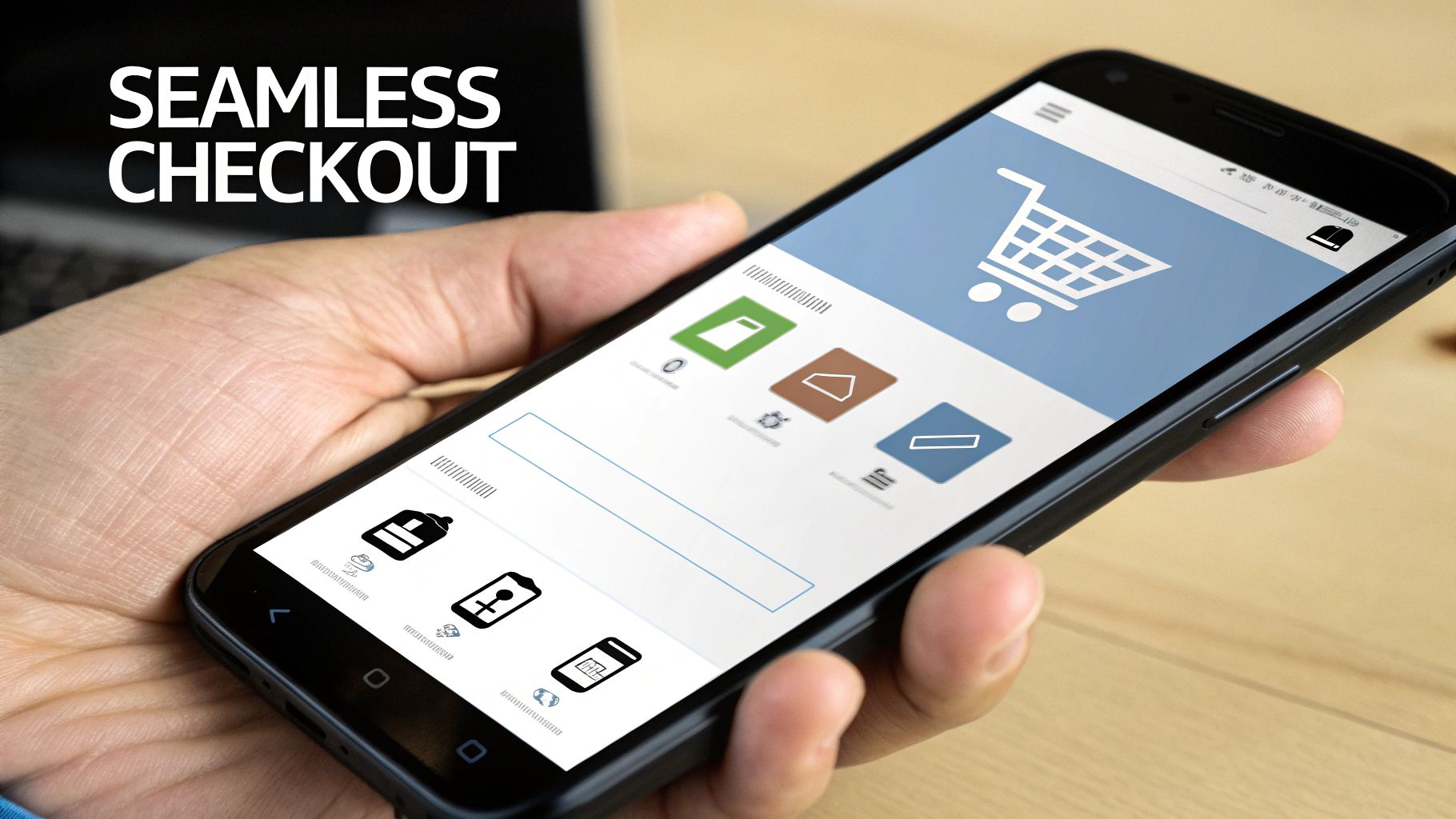
Designing a Frictionless Checkout Process
After all the work you've put into creating an amazing shopping experience, the checkout page is where the sale is won or lost. This is the moment of truth, the final step, and unfortunately, it's where a shocking number of potential customers bail. Your one job here is to make this final phase so smooth, so fast, and so trustworthy that clicking "Complete Purchase" feels like the easiest, most natural thing to do.
Think of it as the last hundred yards of a marathon. A runner doesn't want to suddenly find hurdles or confusing signs right before the finish line. In the same way, a motivated buyer doesn't want to be ambushed by unexpected shipping costs, forced to create an account, or struggle with a clunky form. Every single one of those is a point of friction that makes cart abandonment more likely.
Make Guest Checkout the Default
Forced account creation is one of the biggest conversion killers, period. A first-time buyer has found something they love and is literally trying to give you their money. But then you stop them and ask for a long-term commitment. It’s an immediate turn-off and a top reason people abandon their carts.
The fix is surprisingly simple: always offer a prominent guest checkout option. Let people complete their purchase with the bare minimum—name, shipping address, and payment info. You can always ask them to create an account after the sale is complete, once the pressure is off.
By putting the immediate sale ahead of data collection, you show respect for your customer's time and intent. That simple shift in priority can give your conversion rate a serious boost, especially with new shoppers.
Eliminate Surprises and Build Trust
The other major checkout killer? Last-minute surprises. A customer has mentally agreed to a price, but when they hit that final page, they get slapped with unexpected shipping fees or taxes. That "sticker shock" instantly breaks trust and makes them feel like they've been tricked.
Transparency is your best weapon here.
- Show shipping costs early. If you can, add a shipping cost estimator right on the cart page, before checkout even starts.
- Be upfront about taxes. A simple line that says taxes will be calculated based on their location is all it takes. No surprises.
- Use a progress bar. A simple visual showing steps like "Shipping," "Payment," and "Review" helps manage expectations and makes the process feel much shorter.
Building this kind of trust is fundamental. For more on this, check out these proven strategies to reduce cart abandonment that focus on transparency.
Optimize for Speed and Simplicity
Every single field on your checkout form is another tiny hurdle for your customer. The more you ask for, the more work you're creating. A clean, simple form respects their time and dramatically improves the experience, especially on mobile where typing is a pain.
And mobile is where this really matters. Desktop users convert at 4.8%, but that number drops to just 2.9% on mobile—even though mobile drives 73% of traffic. That huge gap is almost always because of checkout friction on small screens. While the overall cart abandonment rate is a staggering 71.3%, it climbs to 77.2% on mobile. That’s a massive opportunity just waiting for you.
Here’s how to trim the fat from your checkout:
- Cut non-essential fields: Do you really need their phone number? Or a second address line? Ditch anything that isn't absolutely critical to fulfilling the order.
- Use smart defaults: Automatically check the "Billing address is the same as shipping" box. Let them uncheck it if they need to.
- Enable address autofill: Use tools that complete addresses as the user types. It speeds things up and cuts down on typos and delivery errors.
Offer All the Ways to Pay
In today's market, people expect to pay how they want. Limiting payment options is like telling a customer you don’t accept their type of money. A flexible payment gateway isn't a luxury; it's essential for getting every possible sale.
Beyond the standard credit and debit cards, you absolutely should integrate modern payment solutions that make life easier for your customers.
| Payment Method | Key Benefit for Customers | Impact on Conversions |
|---|---|---|
| Digital Wallets (Apple Pay, Google Pay) | Skips manual entry of card and shipping details for a one-tap checkout. | Slashes friction, especially on mobile, which directly leads to higher completion rates. |
| Express Checkout (PayPal, Shop Pay) | Lets users log into a trusted service to complete their purchase in seconds. | Builds trust and saves time. Perfect for users hesitant to enter card info on a new site. |
| Cryptocurrency Payments | A secure, private, and often faster option for a growing, tech-savvy audience. | Attracts a new customer segment and positions your brand as modern and forward-thinking. |
A seamless ecommerce payment gateway integration is the technical backbone that makes all of this possible. By systematically removing every obstacle, you make it incredibly easy for customers to say "yes" at the most important moment of their journey.
Using Psychology to Build Trust and Drive Action
A website that works is one thing, but a website that sells is another entirely. Shoppers are making snap judgments, often based on gut feelings and intuition. Your store doesn't just need to function; it needs to feel compelling and, most importantly, trustworthy. This is where we shift from just displaying products to actively building the confidence someone needs to hit that "buy" button.
Understanding what makes shoppers tick is the secret to improving your e-commerce conversion rate. When a customer feels unsure, they stall. When they feel confident, they buy. Your job is to systematically chip away at that doubt and build up confidence at every single touchpoint.
Build Powerful Social Proof
We’re wired to look to others for cues on what to do. It’s human nature. This is why social proof is probably the most potent tool in your conversion toolkit. It’s not about you telling people your product is great—it's about other customers showing them.
Here’s how to make it work for you:
- Customer Reviews and Ratings: These are table stakes now. You absolutely must have star ratings visible on your category and product pages. Feature detailed, honest reviews that paint a complete picture, warts and all.
- User-Generated Content (UGC): Get your customers to share photos of themselves actually using your products. Slapping that UGC on your product pages provides a real, relatable context that a polished stock photo could never achieve.
- Authentic Testimonials: Pull the best one-liners from your top reviews and splash them on your homepage or near the add-to-cart button. A simple quote like, “This completely solved my problem in two weeks,” hits way harder than any marketing copy you could write.
Display Unmistakable Trust Signals
While social proof builds confidence by showing that others have bought in, trust signals offer direct, immediate reassurance about security and legitimacy. These are the little visual cues that scream, "This is a real business, and your information is safe with us."
Honestly, think of these as the minimum entry fee for earning a customer's trust online.
A customer's trust is incredibly fragile. Every single element on your site either builds it up or tears it down. From a simple return policy link to a security badge in the footer, these signals work together to lower a shopper's guard and make them comfortable enough to pull out their credit card.
Here are the trust signals you can't skip:
- Security Badges: Get those logos from recognizable names like Norton, McAfee, Visa, Mastercard, and PayPal in your site’s footer and, crucially, all over the checkout process.
- Clear Return Policies: Don't bury your return policy in the fine print. Put a simple, reassuring line like "30-Day Hassle-Free Returns" right on your product pages. It immediately lowers the perceived risk of making a bad purchase.
- Accessible Support: Make it ridiculously easy for people to get in touch. A clear "Contact Us" link, a phone number, or a live chat widget shows there are real humans behind the screen, ready to sort out any issues.
Create Urgency Without Being Sleazy
Once you’ve laid that foundation of trust, you can give customers a gentle nudge to act now. This taps into the psychological principle of loss aversion—we’re more motivated by the fear of missing out than by the prospect of gaining something. The trick is to be honest and avoid the kind of high-pressure tactics that feel manipulative.
This isn’t about fake countdown timers or lying about stock levels. It’s about being transparent with real-time information that helps a customer make a decision.
For instance, you can try subtle nudges like:
- Low-Stock Indicators: A simple message like "Only 3 left in stock!" creates genuine urgency around a hot item.
- Limited-Time Offers: Be crystal clear about when a sale or promotion ends. A countdown timer can be a great visual cue during a major sales event.
- Real-Time Activity: Little pop-ups saying "Sarah from Austin just bought this" can help normalize the purchase and add a gentle push to join in.
By weaving together strong social proof with clear trust signals and a touch of ethical urgency, you create an environment where the decision to buy feels not just safe, but smart.
Answering Your Top Ecommerce Conversion Questions
Even with a solid plan in place, you're bound to run into some specific questions once you start digging into conversion optimization. Let's tackle some of the most common ones I hear from store owners. Getting these answers straight can help you set better goals and focus on what truly matters.
What’s a “Good” Ecommerce Conversion Rate, Really?
This is the million-dollar question, and the honest answer is: it depends. There’s no single number that works for everyone. While you'll often hear the global average is somewhere between 2% and 4%, that figure is almost useless without context.
The personal care industry, for example, can hit conversion rates near 7%. On the other hand, the home and furniture space often sits closer to a much lower 1.4%. The numbers are all over the map.
Instead of chasing a generic average, you're far better off benchmarking against your own industry. Even more importantly, focus on beating your own numbers month after month. A well-tuned store can often hit 3-5% or even higher, regardless of the industry standard.
Consistent, internal improvement is the real game you want to be playing.
How Fast Can I Actually See Results?
How quickly you see a lift really comes down to two things: the impact of the change you made and how much traffic your store gets. You need enough data to be sure an improvement wasn't just a lucky fluke.
Quick Wins: If you fix something obviously broken, like a confusing checkout form or by adding an express pay button, you can see a measurable jump in just a few weeks. This assumes you have enough traffic to run a statistically significant A/B test.
Bigger Projects: A complete overhaul of your product pages or a total redesign of your site's navigation? That's a longer game. It could take a few months to truly validate the impact of such a massive change.
The key here is patience. Make your changes, test them properly, and let the data tell you what's working.
Mobile vs. Desktop: Where Should I Focus First?
Ah, the classic debate. The data shows a really interesting picture. Mobile now drives the lion's share of traffic for most stores—we're talking over 70%. But here’s the catch: desktop still converts way better, often around 4.8% compared to just 2.9% on mobile.
So, what does that gap tell you? It tells you that mobile is your single biggest opportunity for growth.
Your site absolutely has to be mobile-friendly to even get visitors in the door. But the real money is made by obsessively smoothing out the friction in your mobile checkout flow. Find out exactly where mobile users are abandoning their carts and start fixing those specific issues. Closing that conversion gap is where you'll find your biggest wins.
At BlockBee, we're all about crushing checkout friction with secure, seamless crypto payment options. By integrating a flexible payment gateway, you open your doors to a global audience and give your conversion rates a serious boost. Get started with BlockBee today and start turning more of your visitors into happy customers.