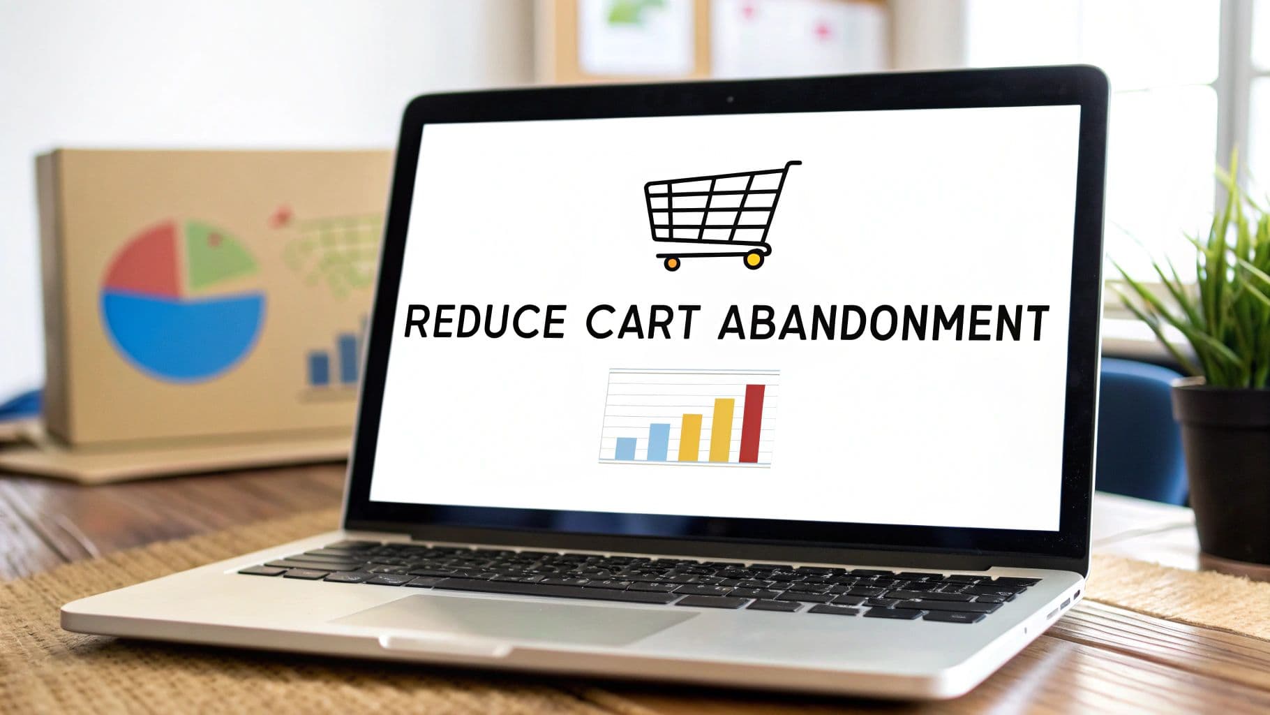
How to Reduce Cart Abandonment and Boost Sales Today
If you want to cut down on abandoned carts, you have to figure out why shoppers are leaving in the first place and then ruthlessly eliminate every point of friction in your checkout. This means digging into user behavior to see where they drop off, making the buying process dead simple, and being completely upfront about every single cost.
Why People Ditch Their Carts and What It's Costing You

It's easy to feel defeated when you look at a high cart abandonment rate. But here's a better way to think about it: this is your single biggest opportunity for growth. It's not a failure. It's a clear signal that people want to buy from you, but something is stopping them. When you start seeing those abandoned carts as low-hanging fruit, everything changes.
The Real Financial Hit
The numbers behind cart abandonment are frankly staggering. The global average sits around 70.19%, which means nearly seven out of every ten shoppers who add something to their cart leave without buying. This adds up to an estimated $4 trillion in lost sales every single year. That's a massive number, and it shows just how much potential is being left on the table.
Don't view abandoned carts as lost sales. Think of them as qualified leads who have explicitly shown interest in your products. Your job is to simply guide them over the finish line.
Common Reasons People Walk Away
Before you can fix the problem, you need to understand the "why." Most shoppers aren't leaving on a whim; they're hitting predictable roadblocks. Time and again, we see the same culprits pop up:
- Surprise Costs: This is the big one. Unexpected shipping fees, taxes, or other charges appearing at the last minute are the number one reason people bail.
- Forced Account Creation: Making someone create an account just to buy something is a classic conversion killer. It adds a layer of friction most people just don't have the patience for.
- Complicated Checkout: If your checkout process is long, confusing, or asks for too much information, you're going to lose people. They expect a fast, smooth transaction.
- Missing Payment Options: Customers want to pay their way. If you don't offer their preferred method, whether it's a digital wallet or even cryptocurrency, you risk alienating them completely. To get a better handle on this, see how you can accept more diverse payment types with modern e-commerce solutions. https://blockbee.io/ecommerce
Tackling these issues head-on is one of the most direct ways to boost your bottom line. Often, the work you do to fix cart abandonment leads to bigger wins across your entire site. You can explore proven strategies to increase overall website conversions to see how these concepts fit into a larger growth plan.
Uncovering the Real Reasons Your Customers Leave

Before you can fix cart abandonment, you have to play detective on your own turf. Generic industry stats are interesting, but the real gold is buried in your store's data. It’s time to stop guessing and start building a strategy based on how your actual customers behave.
The whole game is about pinpointing that exact moment a shopper decides, "Nope, I'm out." Is it when they see the shipping options? The moment they have to create an account? Knowing where they bail is the first major clue to figuring out why.
Digging into Your Checkout Funnel
Your first port of call should always be your website analytics. If you have a tool like Google Analytics set up, you can build a conversion funnel that tracks users step-by-step through your entire checkout flow. This gives you a bird's-eye view of their journey, from the cart page all the way to the final confirmation.
Right away, this funnel will show you which page is leaking the most customers. You might see a huge drop-off on a specific step and realize that 60% of users who start checkout are leaving on the "Create Account" page. That’s not just a statistic; it's a massive, flashing sign telling you that forced registration is killing your sales.
Pro Tip: Keep an eye out for sudden, dramatic drop-offs. A page with a ridiculously high exit rate compared to the one before it is a serious red flag. Something on that page—a surprise fee, a confusing form, or a technical bug—is actively driving people away.
Seeing Through Your Customer's Eyes
The numbers from your analytics tell you what is happening. But to understand the story behind those numbers, you need to see your store from your customer’s point of view.
This is where user session recording tools are absolute game-changers. They let you watch anonymized recordings of real people using your site. You see where their mouse goes, what they click on, and precisely where they get stuck or frustrated.
Watching these recordings can be a humbling experience. You might spot a user trying over and over to click on something that isn't a button, or another getting lost trying to find the guest checkout option. These little friction points add up, and they are a direct cause of abandoned carts.
When in Doubt, Just Ask
Honestly, sometimes the easiest way to get an answer is to simply ask the question. You can get incredibly rich feedback by catching shoppers on their way out the door.
An exit-intent survey is perfect for this. It’s a small pop-up that appears only when a user’s mouse moves toward the exit or back button, signaling they're about to leave the page.
Keep the survey quick and to the point. One question is all you need:
- "What's stopping you from completing your purchase today?"
Provide a few common reasons as multiple-choice options (e.g., shipping costs, technical problems, just browsing) but always include an "Other" text box for open feedback. The replies you'll get are pure gold—direct, unfiltered insights you can use to make immediate, meaningful improvements.
Building a Frictionless Checkout Experience
Once a shopper hits that "buy" button, the checkout process needs to be less like an obstacle course and more like an express lane. This is the moment of truth where a sale is either won or lost. Every single click, confusing form field, or last-minute surprise dramatically increases the chance they'll just give up.
Your one and only goal here is to strip out every bit of friction. You need to make the entire process feel intuitive, lightning-fast, and completely trustworthy. When a customer feels secure and in control, they're not just likely to finish their purchase—they're happy to.
Simplify and Streamline Every Step
Let's be blunt: a clunky, complicated checkout is a conversion killer. People expect speed and simplicity. Forcing them to create an account before they can buy is one of the oldest mistakes in the book. You absolutely must offer a guest checkout option, and it needs to be the most obvious choice on the page. They can always create an account later.
Think about every single piece of information you ask for. Does it add value or friction? Only ask for what is absolutely essential to get the order out the door.
- Embrace Autofill: Make sure your site plays nice with browser autofill for addresses and payment info. This simple feature can shave precious seconds—and a lot of frustration—off the process.
- Show a Progress Bar: If your checkout has multiple pages, a visual progress bar is a game-changer. It shows people exactly where they are and what’s left, which manages their expectations and keeps them moving forward.
- Use Clear Calls-to-Action: Your buttons need to be big, bold, and tell people exactly what to do. "Continue to Payment" is a lot more compelling than a vague "Next."
The second a customer decides to check out, their mindset shifts. They're on a mission and have zero patience for delays. Your job is to honor that by making the next few steps as fast and painless as possible. Any confusion is an open invitation for them to leave.
Be Radically Transparent About Costs
Here it is: the number one reason people abandon their carts is a surprise they didn't see coming. Unexpectedly high costs, especially for shipping, are the top offender, driving away somewhere between 41% and 48% of shoppers.
Being upfront about every single cost is non-negotiable. Don't wait until the final step to reveal shipping fees and taxes. Show them on the product page or, at the very least, in the shopping cart. A shipping calculator in the cart is a fantastic tool for building trust and preventing that last-second sticker shock that kills so many sales.
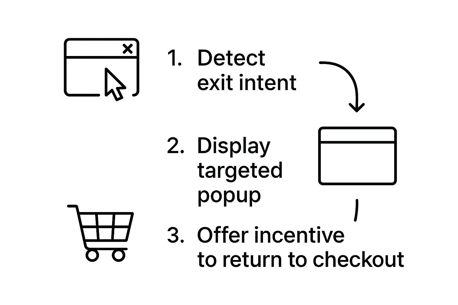
This workflow is a great example of a safety net. An exit-intent popup can detect when someone's about to leave and present a targeted offer to pull them back in. By catching that exact moment of hesitation, you can give them a compelling reason to stick around and finish what they started.
From my experience, checkout is where small details have the biggest impact. I've seen brands boost their conversion rates simply by tweaking button text or reordering form fields. To help you pinpoint these opportunities, I've put together a table of the most common friction points I've encountered and how to fix them.
Top Checkout Friction Points and Their Solutions
| Friction Point | Impact on Customer | Actionable Solution |
|---|---|---|
| Forced Account Creation | Creates an immediate, unnecessary barrier and feels like a commitment. | Offer a prominent guest checkout option. Allow account creation after the purchase is complete. |
| Unexpected Shipping Costs | The leading cause of "sticker shock" and lost trust right at the finish line. | Display a shipping cost calculator in the cart or show estimated shipping on product pages based on location. |
| Long, Confusing Forms | Overwhelms the user and makes the process feel like a chore. | Ask for essential information only. Use browser autofill and single-column layouts for mobile. |
| Lack of Payment Options | A customer can't pay if you don't accept their preferred method. | Integrate popular digital wallets like Apple Pay, Google Pay, and PayPal alongside traditional credit cards. |
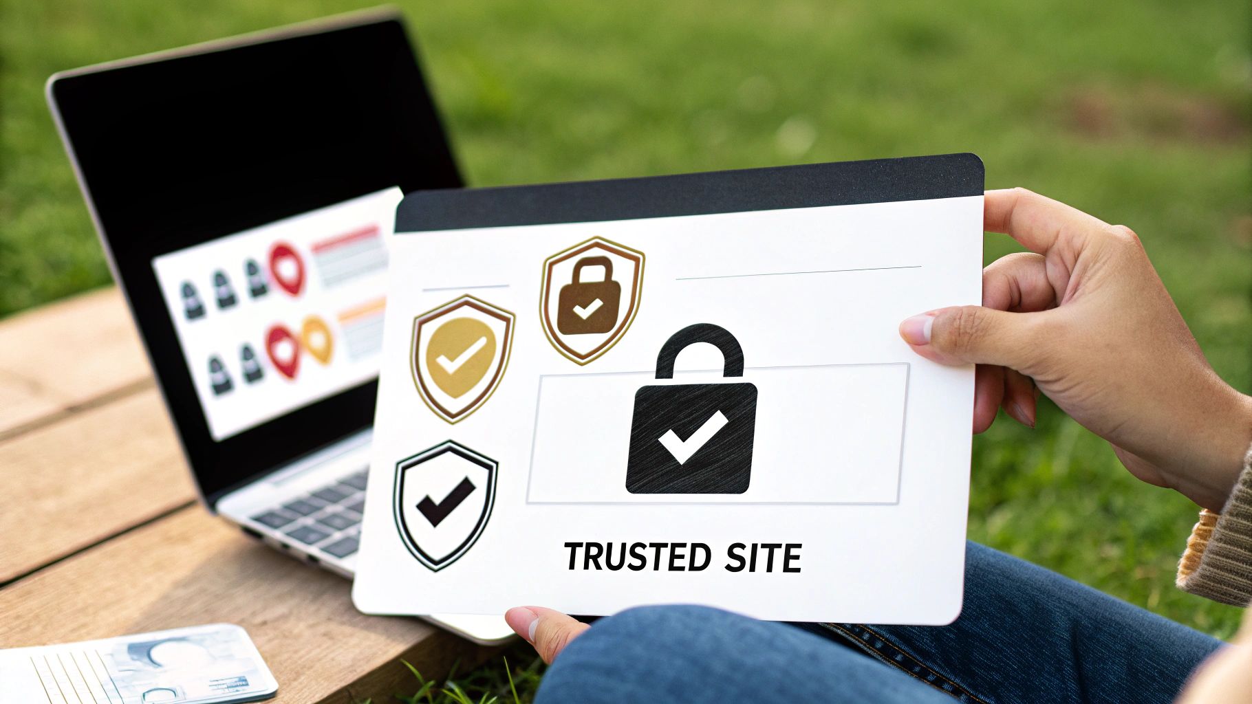
| No Visible Security Badges | Raises red flags about data security, making customers hesitant to enter payment info. | Prominently display trust badges from security providers (e.g., Norton, McAfee) and SSL certificates. |
Looking at this, it's clear that the theme is all about removing uncertainty and effort for the customer. Every solution is designed to make them feel more comfortable and in control of the process.
Offer Flexible and Secure Payment Options
Finally, when a customer is about to hand over their money, trust and convenience are everything. Your checkout page must look and feel secure. Make sure you're displaying trust badges from well-known security providers like Norton or McAfee where people can see them.
Beyond security, you have to offer choice. Not everyone defaults to a credit card anymore. Integrating digital wallets like Apple Pay, Google Pay, and PayPal is standard practice because it’s fast and familiar. For businesses looking to cater to a global or tech-savvy audience, embracing modern payment methods is just as crucial. For example, you can explore ways to optimize your crypto payment process with a custom checkout page.
By giving customers multiple trusted ways to pay, you remove one of the final and most critical barriers to completing a sale.
Winning Back Customers with Smart Remarketing
An abandoned cart isn’t the end of the road. Think of it as an open invitation to continue the conversation. A shopper who puts an item in their cart is one of the most qualified leads you can get—they were literally a click away from buying. Your job now is to gently guide them back, and a thoughtful remarketing strategy is your best tool for that.
This isn't about blasting them with desperate "please buy" messages. It's about creating a helpful, multi-channel dialogue that reminds them of the value they saw in your products in the first place. When you get it right, it feels less like a hard sell and more like genuinely great customer service.
Crafting the Perfect Email Sequence
Email is the absolute foundation of any cart recovery strategy. But sending a single, generic "You forgot something!" message just won't cut it. A well-timed, multi-part email sequence can dramatically boost your chances of winning back that sale. In fact, campaigns using a three-email sequence have been shown to pull in significantly more revenue than those relying on just one.
So, what does a winning sequence actually look like?
- Email 1: The Gentle Nudge (Send within 1 hour): The purchase is still fresh in their mind. Maybe their kid started crying, or their boss walked in. The reason they left could be as simple as a distraction. Keep the tone here helpful and low-pressure. A simple "Did you run into any trouble?" can work wonders.
- Email 2: The Value Reminder (Send 24 hours later): Now's the time to re-engage them by highlighting what they're missing. You can build a little urgency or, even better, showcase what makes the product special. Think about including social proof, like snippets from your best 5-star reviews.
- Email 3: The Compelling Offer (Send 48-72 hours later): If they still haven't come back, it's time to sweeten the deal. This is your moment to introduce a compelling incentive. A small discount (10% off) or, my personal favorite, free shipping, can often be just the push they need to finally click "buy."
Pro Tip: Whatever you do, don't offer a discount in that first email. You'll just train savvy shoppers to abandon their carts on purpose to snag a deal. Save your best offers for the final follow-up as a reward for their consideration, without cheapening your brand.
Going Beyond the Inbox
Email is a powerhouse, but a truly effective re-engagement plan meets customers wherever they are. By using a few different touchpoints, you can reinforce your message without ever feeling pushy.
Retargeting Ads on Social Media
Have you ever looked at a product online, only to see it pop up in your Instagram feed an hour later? That’s the magic of dynamic retargeting ads. Platforms like Facebook and Instagram can automatically show a user the exact products they left behind. It's an incredibly powerful visual reminder that catches them while they're casually scrolling.
SMS Remarketing
For customers who've opted in to receive texts, a well-timed SMS can be your secret weapon. It cuts right through the noise of a crowded inbox. A simple, friendly message like, "Still thinking it over? Your cart is waiting for you!" with a direct link back to checkout is all it takes. Just be sure to use this channel sparingly to maintain its impact.
By combining a smart email sequence with targeted ads and a few strategic text messages, you're building a safety net that grabs a shopper's attention across different platforms. This gives them multiple, convenient chances to finish what they started and can even prompt you to learn more about new friction-reducing options like how to accept crypto payments for your business.
Catering to Mobile and Global Shoppers
A checkout flow that works beautifully on a desktop can completely fall apart on a mobile device. And let's be honest, mobile commerce isn't the future—it's the present. If your store isn't built for the small screen, you're already behind.
At the same time, your next loyal customer could be halfway around the world. Thinking globally isn't just for the big players anymore. Nailing the experience for both mobile and international shoppers is how you stop leaving easy money on the table.
Designing for the Mobile-First Majority
The numbers don't lie. The device someone uses to shop dramatically changes their likelihood of finishing a purchase. Mobile users abandon carts at a staggering rate of 75.5% to 80%, while desktop users are much lower at 66%-70%. That gap is a massive opportunity staring you right in the face. You can dig deeper into these shopping cart abandonment statistics on sellerscommerce.com.
To win over mobile shoppers, you have to think like one.
- Make it Thumb-Friendly: Are your buttons big enough to be tapped easily with a thumb? Can users navigate without having to pinch and zoom? These aren't minor details; they make or break the experience.
- Keep Forms Simple: Stick to a single-column layout. Be ruthless about every field you ask for—if it's not absolutely essential, cut it. Each extra field is another chance for them to bounce.
- Embrace One-Tap Payments: Integrating digital wallets like Apple Pay and Google Pay is a game-changer. It lets customers skip the tedious process of typing in their card details and address, turning a chore into a single, secure tap.
A mobile shopper's patience is razor-thin. If they have to struggle to fill out a form or find a button, they're gone. The goal is to make buying on a phone feel faster and more convenient than walking over to a laptop.
Welcoming Your International Customers
Offering worldwide shipping is just the first step. To truly capture a global audience, you have to make shoppers from other countries feel like your store was built just for them. This is all about localization—removing the friction and doubt that naturally comes with buying from a foreign website.
In some regions, particularly across the Middle East, Africa, and Asia Pacific, cart abandonment can spike to nearly 90%. A huge driver of this is a checkout that feels unfamiliar or untrustworthy.
To build that critical sense of trust and familiarity, you absolutely need to get these things right:
- Show Prices in Their Currency: Use geolocation to automatically display prices in the shopper's local currency. No one wants to pull out a calculator to figure out what they’re spending.
- Provide Local Payment Options: Credit cards aren't the go-to payment method everywhere. In the Netherlands, people expect to see iDEAL. In Brazil, Boleto is king. Do your research and offer the payment methods your target customers actually use.
- Be Upfront About All Costs: Hidden fees are the ultimate conversion killer. International shipping costs, import duties, and taxes need to be calculated and shown clearly before the final payment step. A surprise charge is a guaranteed way to lose the sale.
Answering Your Top Cart Abandonment Questions
As you start digging into your cart abandonment strategy, a few key questions always pop up. It’s natural. Fine-tuning your checkout and recovery efforts means making smart, deliberate choices, not just guessing.
Let's walk through some of the most common questions we hear from merchants. The answers here are based on what actually works, so you can build a recovery plan that feels helpful to your customers and actually boosts your revenue.
What’s a Good Cart Abandonment Rate, Really?
Everyone wants a magic number, but the truth is, there isn't one. While you'll see the industry average floating around 70%, a "good" rate is all about context.
A store selling custom-built furniture will naturally have a higher abandonment rate (think 80% or more) than a site selling, say, coffee beans, which might see a rate closer to 50%. People take longer to decide on big purchases.
Instead of chasing an arbitrary benchmark, focus on your own numbers. Figure out your current rate and set a realistic goal to improve it by 5-10%.
Your real competition isn't some industry average; it's your store's performance last month. Focus on steady, measurable progress. That's how you win.
How Soon Should I Send That First Recovery Email?
Timing is absolutely critical here. You need to strike while the iron is hot.
The sweet spot for that first email is within one hour after the shopper leaves. The purchase is still fresh in their mind. Maybe their kid started crying, their boss walked in, or the WiFi just blinked out. A quick, friendly reminder can be all it takes to bring them right back.
For the rest of your email sequence, give it some breathing room. Here’s a cadence that works well:
- Email #2: Send it 24 hours later.
- Email #3: Send it 48 to 72 hours after that.
This approach keeps you on their radar without coming across as pushy.
Should I Slap a Discount in My Recovery Emails?
Hold on—don't be too quick to give away your margin. It's incredibly tempting to lead with a discount, but it can backfire spectacularly.
If you offer a coupon in the very first email, you might be training your customers to abandon their carts on purpose. Savvy shoppers catch on fast, and this behavior will eat into your profits over the long haul.
A much better strategy? Make your first email a pure customer service gesture. A simple, "Did you run into any trouble?" or "Your items are waiting for you!" works wonders.
If they still haven’t come back, then you can introduce an incentive in your second or third email. A small nudge like 10% off or, even better, free shipping, often provides the final push they need without devaluing your products from the get-go.
What Else Works Besides Email?
Email is your workhorse, but a multi-channel strategy is the key to maximizing your recovery efforts. Think about where your customers spend their time. Two channels consistently deliver great results:
- SMS Remarketing: Text messages have insane open rates. A short, direct SMS with a link back to their cart cuts through the noise and gets seen almost instantly.
- Dynamic Retargeting Ads: Platforms like Facebook and Instagram are perfect for this. You can serve up ads featuring the exact products they left behind. It’s a powerful visual reminder that follows them onto their favorite social feeds.
By layering these methods on top of email, you create a powerful system that reconnects with shoppers on different platforms, giving you far more chances to win back that sale.
At BlockBee, we know that a clunky payment process is a major cause of cart abandonment. Our platform helps you offer the flexible, secure, and modern payment options today's customers demand, including a wide variety of cryptocurrencies. By eliminating friction at the most critical step, you can convert more shoppers into loyal customers. Learn how BlockBee can streamline your checkout experience.