How to Reduce Checkout Abandonment: how to reduce checkout abandonment (guide)
Let's be honest, that moment a customer adds an item to their cart feels like a win. But it's not the finish line. The real test is the checkout, and it's where countless sales fall apart. The number one reason? Unexpected costs that pop up right at the end. It feels like a bait-and-switch, and it's just one of many small frustrations that can kill a sale.
Fixing checkout abandonment isn't just about tweaking a button color. It’s about digging into the psychology of your buyer and smoothing out every bump in the road that makes them second-guess their decision.
So, Why Are Shoppers Really Leaving?
Think of every abandoned cart as a conversation that abruptly ended. Your customer was excited, they wanted what you were selling, but something you did—or didn't do—made them walk away. This isn't just a lost sale; it's a critical breakdown in the customer's journey, right at the moment of truth. To stop the bleeding, you first have to figure out where the wounds are.
This isn't a small problem, and it's getting worse. The global average shopping cart abandonment rate has crept up to a massive 70.19%. To put that in perspective, it was just under 60% back in 2006. We're talking about an estimated £23.96 trillion in lost sales globally. For anyone running a store on platforms like WooCommerce or Shopify, this isn't just a statistic; it's a huge opportunity waiting to be unlocked.
The problem gets even more dramatic on mobile, where abandonment rates can jump to 75.5%. This is a clear signal that a clunky mobile checkout experience is practically a welcome mat for your competition. If you want to dive deeper into the numbers, there's a great breakdown of the latest shopping cart abandonment statistics you can check out.
The Psychology Behind Hitting 'Close Tab'
At its heart, abandoning a cart is almost always an emotional reaction to a bad user experience. Picture this: a shopper has found the perfect product. They're ready to hand over their money. Then, they hit the checkout page and are greeted with a series of unexpected hurdles.
First, those surprise costs. A customer has a price locked in their head. When they suddenly see high shipping fees, taxes, or other random charges tacked on, it feels dishonest. That feeling instantly shatters the trust you've worked so hard to build.
Then comes the dreaded "Create an Account" roadblock. Forcing someone to sign up before they can pay is a major conversion killer. Most people just want to get in, buy their thing, and get out. The thought of another password to remember or the fear of a lifetime of marketing emails is enough to make them give up.
A customer who makes it to your checkout has already decided to buy. The only thing that can stop them is you. Every unnecessary field, every surprise fee, and every moment of confusion is a self-inflicted wound to your conversion rate.
Common Friction Points That Drive Customers Away
Beyond surprise fees and forced sign-ups, there's a whole host of other little things that can derail a purchase. A checkout process that feels more like filling out a tax return than making a simple purchase will test anyone's patience. The goal should be a flow so smooth and intuitive that the customer barely notices it.
To help pinpoint where things might be going wrong, we've put together a table summarizing the most common issues we see.
Top Reasons for Checkout Abandonment and Their Impact
| Abandonment Reason | Percentage of Shoppers Affected | Actionable Solution |
|---|---|---|
| Unexpected Extra Costs | 48% | Display all costs (shipping, taxes) upfront on product or cart pages. Offer a shipping calculator. |
| Forced Account Creation | 24% | Implement a guest checkout option. Make account creation optional and offer a clear benefit. |
| Slow Delivery Times | 22% | Offer multiple shipping speeds, including expedited options. Clearly communicate estimated delivery dates. |
| Complicated Checkout Process | 17% | Simplify the form to only essential fields. Use a single-page or accordion-style checkout. |
| Website Errors / Crashes | 13% | Conduct regular performance audits and user testing. Ensure robust server infrastructure. |
| Lack of Trust / Security Concerns | 12% | Prominently display trust seals (SSL, McAfee, etc.). Use a professional design and clear privacy policy. |
As you can see, the issues range from logistical hurdles to deep-seated trust issues. A few other common culprits to watch out for include:
- Limited Payment Options: Today's customers expect choice. If you don't offer their preferred method—whether it's a digital wallet like Apple Pay, cryptocurrency, or a "buy now, pay later" service—they're likely to look elsewhere rather than find a different card.
- Painfully Slow Performance: A checkout page that takes forever to load is a guaranteed sale-killer. In our world of instant gratification, any delay feels unprofessional and can make your site seem insecure.
- Perceived Security Risks: If your checkout page looks like it was designed in 2005, lacks clear security badges (like SSL certificates), or asks for weirdly personal information, alarm bells will start ringing for your customers. They need to feel completely confident that their financial data is in safe hands.
By zeroing in on these specific friction points, you can start patching the holes and turn your checkout from a leaky bucket into a conversion machine.
Designing a Frictionless Checkout Experience
Let's be blunt: a clunky checkout doesn't just annoy customers—it actively kills sales. The moment someone decides to buy, your single most important job is to get out of their way and make paying as easy as breathing. Every unnecessary click, confusing form field, or slow-loading page is a potential exit ramp off your sales highway.
This journey from a full cart to an abandoned one is all too common, and it's usually paved with entirely preventable obstacles.
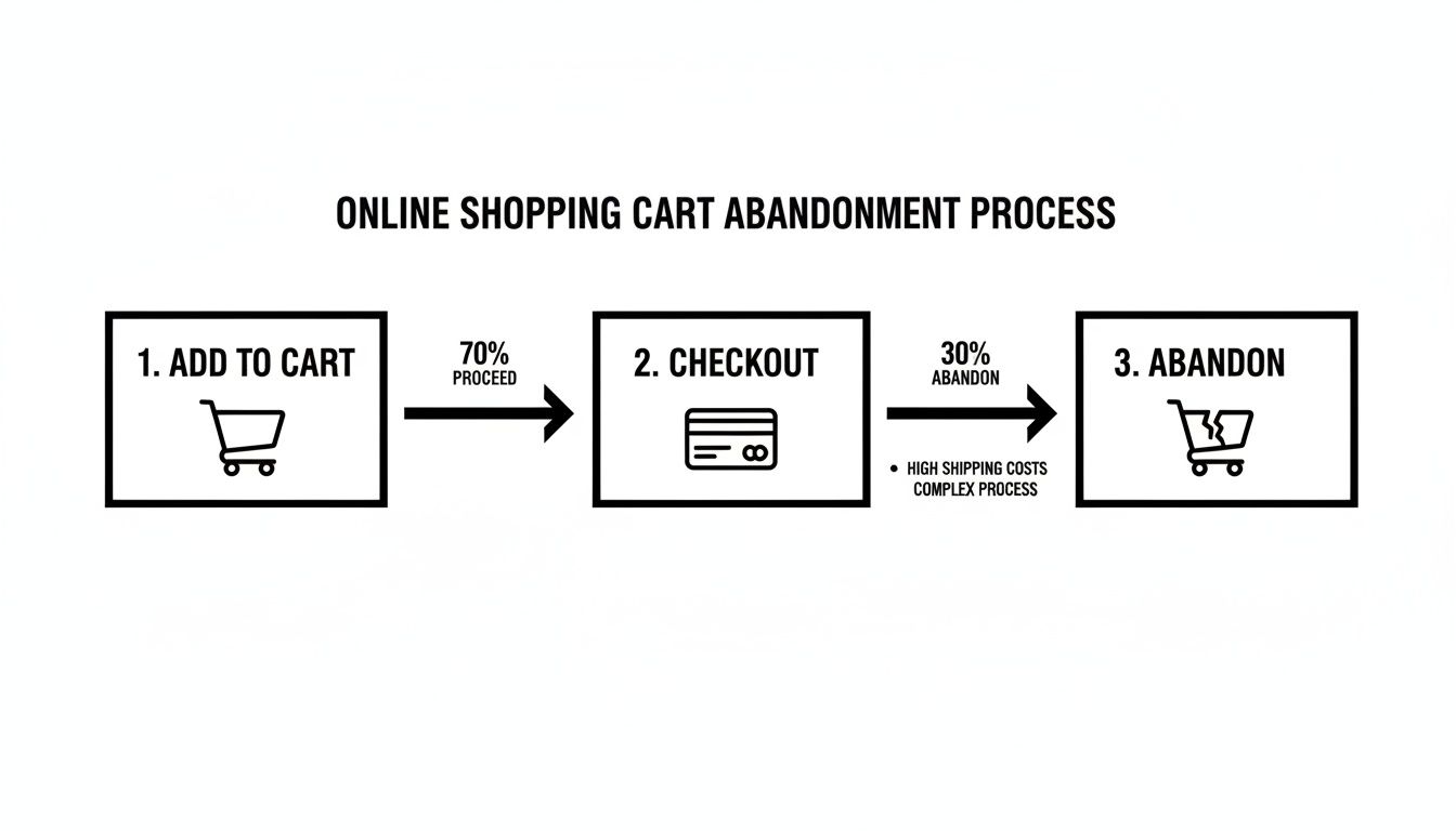
As you can see, those little frustrations add up fast, quickly souring a customer's initial excitement. So, how do we start bulldozing these barriers?
Kill the "Create an Account" Roadblock
Forcing a customer to register an account before they can give you money is one of the oldest and most stubborn conversion killers in e-commerce. The data doesn't lie: a staggering 24% of shoppers will ditch a purchase if you make them sign up first. They came to buy a product, not to sign a long-term contract with your brand.
The fix is incredibly simple but profoundly effective: offer a guest checkout option, and make it the most obvious choice. This one move shows respect for your customer's time and instantly removes a huge point of friction.
You can always prompt them to create an account after the sale is complete. A simple "Want to save your info for next time?" on the confirmation page is a much friendlier invitation.
A guest checkout isn't about losing customer data; it's about closing the deal. A completed sale from a guest is infinitely more valuable than a detailed profile from a cart that was left behind.
Ruthlessly Simplify Your Forms
Every single box a customer has to fill in is another chance for them to second-guess their purchase and leave. The average checkout flow has over 11 different form fields, but the best-performing sites have far fewer. Your mission is to collect only the bare-minimum information required to process the payment and ship the order.
Here’s how you can start trimming the fat:
- Combine Fields: Why ask for "First Name" and "Last Name" separately? Just use a single "Full Name" field.
- Embrace Autofill: Leverage browser autofill and address lookup APIs to do the heavy lifting. A single click to confirm an address is always better than typing it all out.
- Hide What's Optional: That "Address Line 2" field? Keep it tucked away unless someone actually needs it. A cleaner form looks far less intimidating.
- Use Smart Defaults: The vast majority of the time, the billing and shipping addresses are the same. Pre-check that box for them.
For a deeper dive into the design elements that keep customers on track, these tips on how to reduce cart abandonment with better website design are a great resource.
Provide Clarity and Build Momentum
Uncertainty breeds anxiety, especially when money is involved. Customers need to know where they are in the process and how close they are to the finish line. A visual progress bar is a perfect tool for this.
Clearly labeling the steps—like "Shipping," "Payment," and "Review"—gives shoppers a sense of control and shows them they're making tangible progress. This simple visual cue is incredibly reassuring and makes them much more likely to complete the final step.
And on a technical note, your page speed has to be top-notch. A checkout page that hangs for even a couple of seconds feels not just frustrating but untrustworthy. Prioritize optimizing your images, using a good CDN, and leveraging browser caching to ensure the final step is lightning-fast. For more on this, check out our guide on the best practices for ecommerce checkout.
How to Build Unbreakable Trust in Your Payment Flow
You can have the most beautiful store and the slickest checkout, but it all falls apart if a customer pauses at that final step, thinking, "Is my information safe here?" That single moment of doubt is where countless sales go to die. Building and displaying trust isn't a bonus feature; it's the absolute foundation of a successful payment process.
When a customer gets ready to type in their payment details, they're taking a leap of faith. Your job is to make that leap feel as small and secure as possible with clear, visual reassurance.
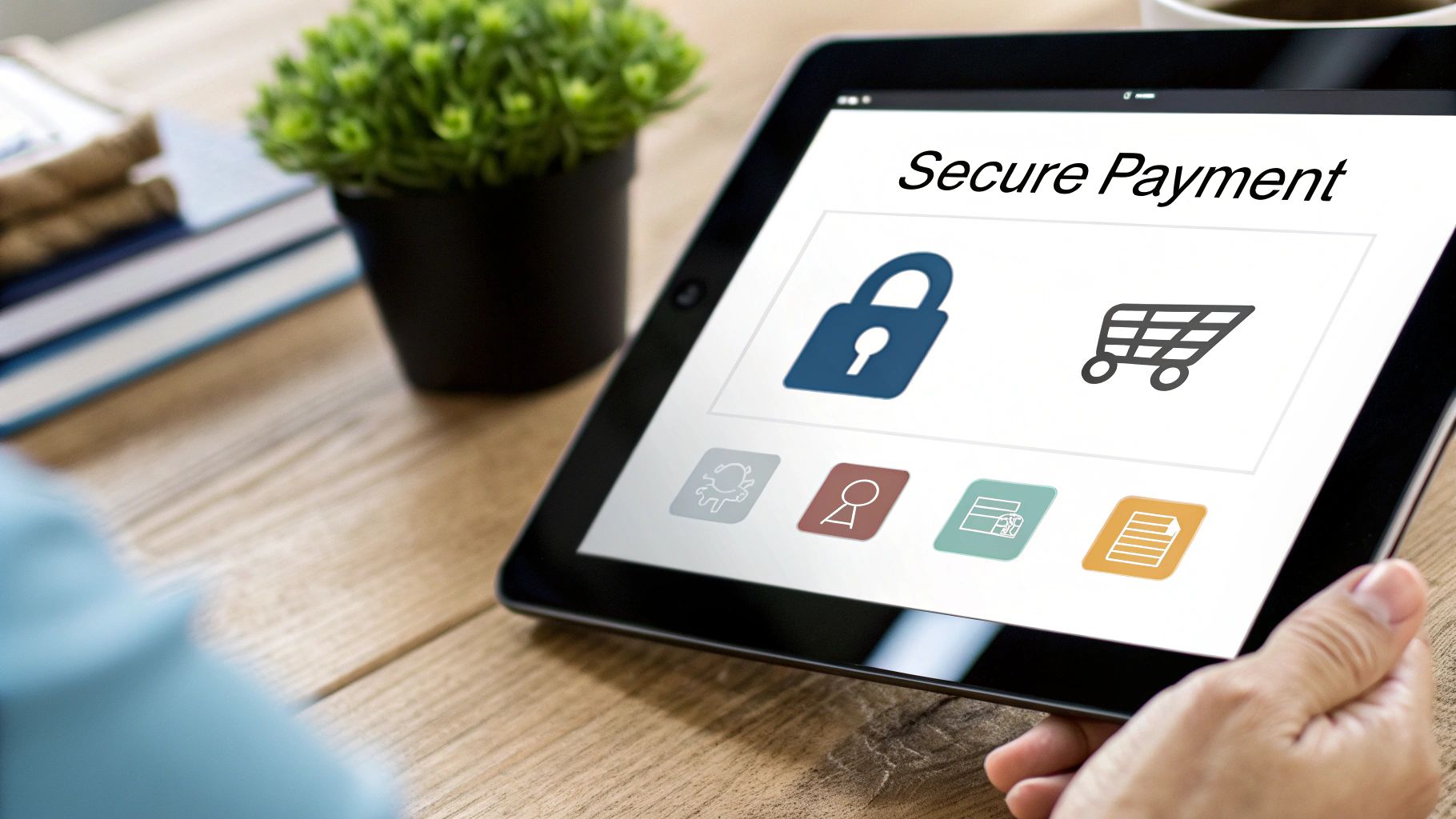
Display Prominent Trust Signals
Trust signals are the visual shortcuts that instantly tell a shopper your store is legit and secure. Think of them as the digital version of a clean, well-lit storefront. When you place them strategically, they can shut down skepticism before it even starts.
Some of the most effective signals are things your customers already recognize:
- SSL Certificates: That little padlock icon in the browser's address bar is non-negotiable. It's the universal sign of a secure, encrypted connection, and customers look for it.
- Security Badges: Logos from familiar security companies like McAfee or Norton act as a powerful third-party endorsement of your site's safety.
- Accepted Payment Logos: Displaying the logos for Visa, Mastercard, PayPal, and even the cryptocurrencies you accept shows you’re integrated with reputable payment networks.
The key is placement. Put these logos and badges right near the payment input fields and your final "Complete Purchase" button. This is where customer anxiety peaks, and that visual reinforcement makes a world of difference.
Diagnose and Prevent Payment Failures
Beyond just looking trustworthy, your payment process has to be trustworthy. Nothing screams "unreliable" like a payment that fails for no clear reason. These technical glitches are silent conversion killers and can do lasting damage to your brand’s reputation.
Security worries and payment failures are a huge reason for cart abandonment. In fact, 19% of shoppers will ditch a cart if they have doubts about security, and a clunky 3D Secure process will scare away another 22%. Even worse, when a legitimate payment is incorrectly flagged as fraud, 32% of those customers swear they'll never come back.
A buggy, error-prone payment page doesn't just lose you one sale; it tells the customer your business might be unprofessional or, even worse, insecure. Every failed transaction erodes the trust you’ve worked so hard to build.
Many payment failures stem from simple user errors—an expired card, a mistyped CVC. The best way to handle this is with real-time form validation. This catches mistakes instantly and provides helpful, specific error messages ("Looks like your card has expired!") that guide the user to a solution without forcing them to start the whole process over.
Offer Modern and Secure Payment Alternatives
One of the best ways to build trust is to offer payment methods that put the customer in control and minimize your own data liability. This is where modern solutions, especially cryptocurrency payments, really start to shine.
When a customer pays with crypto through a service like BlockBee, they aren't handing over sensitive financial data like a credit card number. Instead, the transaction is authorized directly from their wallet. This completely changes the security dynamic for the better.
Let's break down the real-world difference between traditional and crypto payments when it comes to common friction and security issues.
Traditional Payments vs. Crypto Payments: A Security and Friction Comparison
| Feature | Traditional Payments (Cards, Wallets) | BlockBee Crypto Payments |
|---|---|---|
| Data Breach Risk | High. Merchant stores or processes sensitive cardholder data, creating a target for hackers. | None. No sensitive customer financial data is ever stored by the merchant. |
| Chargeback Fraud | High risk of "friendly fraud," leading to lost revenue and chargeback fees. | Eliminated. Crypto transactions are final and cannot be reversed by the customer. |
| Customer Anonymity | Low. Personal and financial details are shared with multiple parties. | High. Customers can pay directly from their wallet without sharing personal info. |
| Cross-Border Fees | Often high and complex, involving currency conversion and international transaction fees. | Minimal. Based on network fees, which are often far lower than traditional rates. |
| Authentication Friction | Can be high (e.g., clunky 3D Secure pop-ups) leading to abandoned carts. | Low. Simple wallet-to-wallet transaction authorized by the user. |
As you can see, integrating crypto isn't just about adding another payment option; it's a strategic move to reduce risk and friction for both you and your customers.
By integrating a secure, non-custodial crypto payment gateway, you signal to your customers that you're serious about modern security standards. For a detailed walkthrough, our guide on ecommerce payment gateway integration is a great place to start. This proactive approach turns your payment options from a potential point of friction into a tangible reason for customers to trust you.
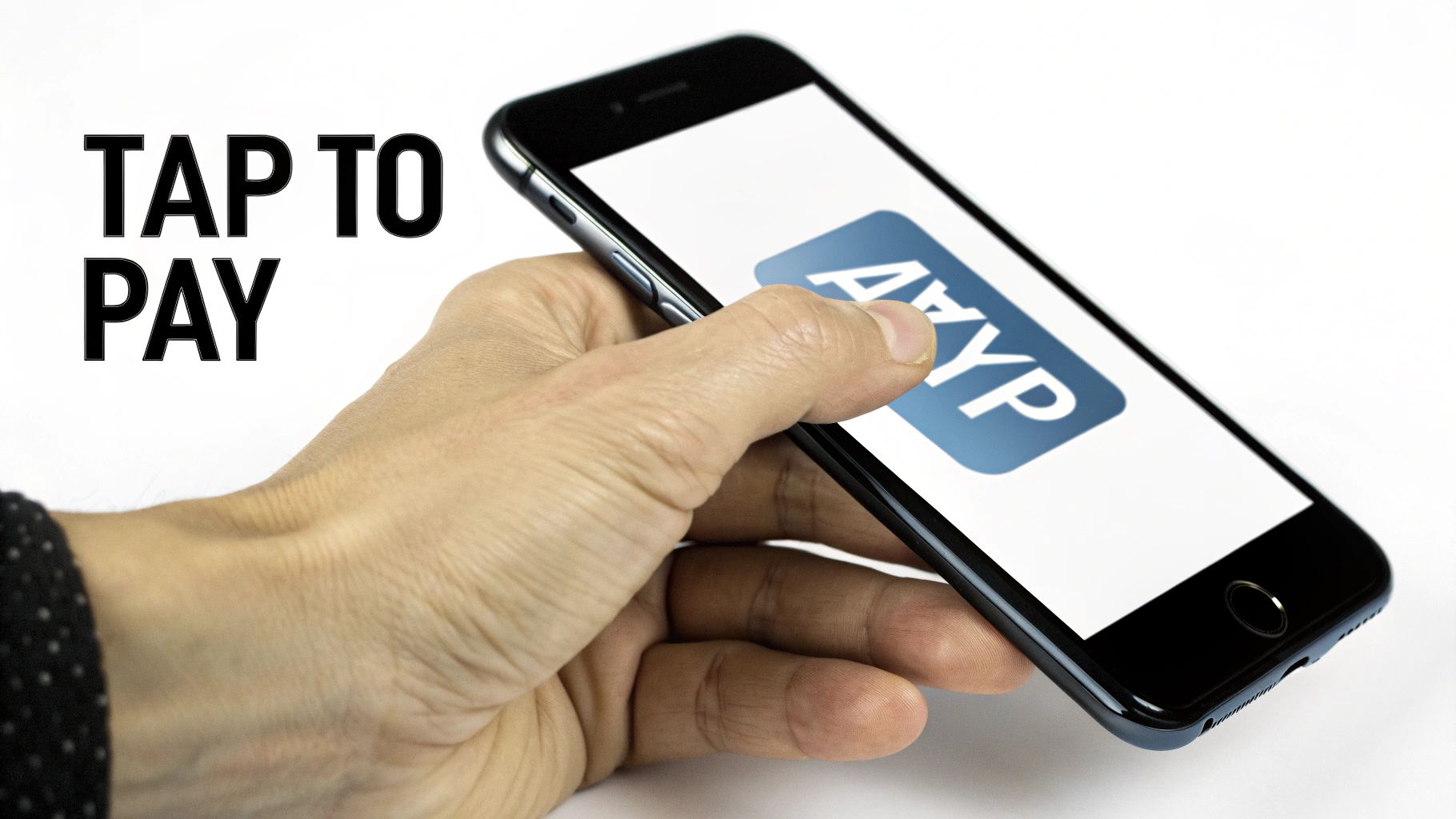
Winning on Mobile with Smarter Payment Options
If your checkout isn't built for a thumb, you're just throwing away sales. Seriously. The days of simply shrinking your desktop site and calling it "mobile-friendly" are long over. Most of your traffic is probably already coming from smartphones, which means a mobile-first payment flow isn't just a nice-to-have—it's a basic requirement for staying in business.
Every time a customer has to pinch-to-zoom, squint at a tiny form field, or try to tap a microscopic button, you're adding friction. And friction is the enemy. It's what makes busy, on-the-go shoppers give up. The numbers don't lie: mobile checkout abandonment is a huge leak in the e-commerce bucket. In January 2025, a staggering 77.65% of mobile users ditched their carts, a rate that blows desktop abandonment out of the water.
This gap is fueled by pure frustration on small screens, from pages that take forever to load to forms that feel impossible to fill out while you're walking or waiting for a train. If you want to see the full, painful picture, dive into the data behind mobile shopping cart abandonment.
Designing for the Thumb, Not the Mouse
Optimizing for mobile means you have to completely rethink the experience. Forget the mouse. Your goal should be a checkout so smooth that someone can breeze through it with one hand while holding a coffee in the other.
Start by switching to a clean, single-column layout that flows naturally as you scroll. It’s how people use their phones. From there, zero in on these high-impact changes that make a real difference:
- Make Buttons Big and Tappable: Every single CTA, from "Continue to Payment" to "Complete Order," should span the full width of the screen. This simple change gets rid of those annoying "fat-finger" mistakes and keeps the checkout process moving forward.
- Simplify Your Forms: On a small screen, less is always more. Collapse optional fields like "Address Line 2" and lean heavily on browser autofill to do the heavy lifting for shipping and payment details.
- Use Numeric Keypads Intelligently: When a user taps into a field for a phone number, zip code, or credit card, the numeric keypad should pop up automatically. It’s a small touch that has a massive impact on how smooth the experience feels.
On mobile, convenience isn't just a feature; it's the entire product. A checkout that feels clunky or difficult on a small screen will be abandoned almost instantly, no matter how great your products are.
The Power of Payment Diversity
A slick mobile design is a great start, but it's only half the battle. To really slash that abandonment rate, you need to offer the payment options that modern, tech-savvy customers actually want to use. This means looking beyond just credit cards and catering to a global audience that values speed, security, and control over their own data.
This is where integrating diverse payment methods—especially cryptocurrency—can give you a serious edge. For a growing number of shoppers, particularly in younger demographics, crypto isn't a weird novelty; it's just how they prefer to pay. Offering it shows you get it and that your business is in tune with their world.
Integrating Seamless Crypto Payments
Adding crypto to your checkout doesn't have to be a massive technical headache. With a platform like BlockBee, you can plug a secure crypto payment gateway right into your existing e-commerce site. We have official plugins for major platforms like WooCommerce and Magento, which makes the whole process surprisingly straightforward for merchants and their dev teams.
But this isn't just about adding another payment button. It's about introducing features that solve real checkout problems:
- Instant Payouts: Forget waiting days for funds to settle. Crypto payments can be confirmed and in your wallet fast, which is great for cash flow.
- Reusable Deposit Addresses: For your repeat customers or subscription-based services, offering a static, reusable address makes future payments ridiculously easy. It’s a frictionless experience that builds loyalty.
- Enhanced Security: Since customers pay directly from their own wallets, you never have to touch or store their sensitive financial info. This dramatically cuts your security liability and builds a ton of trust.
By giving your customers these kinds of advanced payment options, you're not just stopping people from leaving. You're actively attracting a new and growing customer base that many of your competitors are still ignoring. You turn your checkout from a potential point of failure into one of your best tools for conversion and growth.
Building a Powerful Cart Recovery Strategy
So, you've polished your checkout flow until it shines. That's great! But let's be realistic—shoppers will still get distracted. Life happens. A dog starts barking, a meeting reminder pops up, or they just get cold feet.
An abandoned cart isn't a lost sale, though. I like to think of it as an invitation to start a new conversation. A proactive recovery strategy is your single best tool for turning these near-misses into actual revenue.
After all, these aren't cold leads. These are people who showed clear intent. They browsed, they chose a product, and they took the time to add it to their cart. They just needed a gentle, timely nudge to get them over the finish line. This is where automated email and SMS sequences truly prove their worth.
Crafting a Winning Email Sequence
Look, sending a single "you left something behind" email is better than nothing, but a well-timed, multi-part sequence is where you'll see the real results. Think of it as a friendly, escalating conversation, not a one-off demand. In my experience, a three-email sequence hits the sweet spot—it maximizes conversions without annoying your potential customer.
Here’s a structure I’ve seen work wonders time and time again:
- The First Reminder (1 Hour Post-Abandonment): Keep this one simple and helpful. The tone should be light and service-oriented. Maybe their internet dropped or they had to run. The only goal here is to remind them what they were looking at and give them a direct link back to their cart. No discounts, no pressure. Just a friendly, "Did you forget something?"
- The Second Reminder (24 Hours Post-Abandonment): Now you can dial things up just a bit. Introduce a touch of urgency or social proof. A subject line like "Your cart is about to expire" or "Heads up! Others are looking at these items" can be incredibly effective. This is also a great time to address common hesitations by linking to your FAQ page or highlighting your return policy.
- The Final Offer (48-72 Hours Post-Abandonment): This is your last real shot. If it fits your brand strategy, now's the time to introduce a modest incentive, like 10% off or free shipping. Make sure you frame it as a limited-time offer to create a genuine sense of urgency and push for that final click.
An abandoned cart email isn't just a sales pitch; it's a chance to overcome whatever hesitation made the customer leave. Use your copy to remind them of the value, build trust, and make it ridiculously easy to finish their purchase.
Leveraging SMS for Immediate Impact
Email is powerful, but SMS has an immediacy that's just unbeatable. I mean, the average open rate for SMS messages is a staggering 98%. That makes it an insanely effective channel for time-sensitive reminders. If you want to get proactive, implementing marketing automation SMS can send those nudges straight to your customer's phone.
A simple text sent a few hours after they leave, like "Hey [Name], still thinking it over? Your items are waiting for you at [Cart Link]," can work wonders. The trick is to keep it short, personal, and conversational.
Re-Engaging Shoppers Before They Even Leave
The best recovery strategy? The one that prevents abandonment in the first place. Modern tools can help you re-engage customers right in that critical moment when they're about to bounce.
- Exit-Intent Pop-ups: These trigger when a user’s cursor moves toward the "close tab" button. A well-designed pop-up offering a last-minute discount, asking for quick feedback, or offering to save their cart for later can be that final appeal that keeps them on the page.
- AI-Powered Chatbots: A chatbot can proactively jump in if a user seems to be lingering on the checkout page. A simple "Need help with your order?" can open a dialogue that solves a customer's problem in real-time, stopping them from leaving out of pure frustration.
By combining these automated, multi-channel tactics, you turn abandonment data from a frustrating metric into one of your most powerful assets for winning back revenue. And when you need to track complex payment events from all these different channels, understanding tools like IPNs is crucial. You can learn more about how they work in our article explaining what is an IPN.
Your Top Questions About Checkout Abandonment, Answered
When you're deep in the e-commerce trenches, a lot of questions pop up, especially when it comes to that final, crucial step: the checkout. Let's tackle some of the most common ones I hear from merchants who are trying to solve the puzzle of abandoned carts.
What’s a "Good" Checkout Abandonment Rate?
Everyone wants to know the magic number, but the truth is, it depends. While the global average sits at a staggering 70%, a "good" rate is really specific to your industry and what you sell.
For most online stores, getting that number below 50% is a fantastic first milestone. If you're in a niche with low-cost, quick-decision products, you might even see rates dip into the 20-30% range.
My advice? Stop chasing a universal benchmark. Instead, focus on your own data. If you see a steady drop month after month, you're on the right track. That's the real sign of progress.
How Do I Lower Abandonment Without Giving Away Discounts?
Discounts are an easy lever to pull, but they're a slippery slope that can wreck your profit margins. The good news is some of the most effective fixes have nothing to do with price. It all comes down to making the checkout experience better.
Here are a few things you can do that don't involve slashing prices:
- Offer Guest Checkout: I can't stress this enough. Forcing someone to create an account is like putting a locked door in front of the cash register. It's a top reason people walk away.
- Show All Costs Upfront: Nobody likes a nasty surprise. Displaying shipping, taxes, and any other fees right from the start is the single biggest thing you can do to prevent sticker shock.
- Shorten Your Forms: Go through your checkout form field by field and ask, "Do I really need this?" Every box you can eliminate makes the process feel faster.
- Add Trust Signals: Little things make a big difference. Make sure your SSL certificate badges and the logos of payment methods you accept are clearly visible. It tells shoppers their information is safe.
Your goal should be to make the checkout so seamless and trustworthy that a discount feels like a nice bonus, not a bribe to get them to complete the purchase.
How Many Steps Should My Checkout Have?
There's no single right answer here, but the golden rule is less is more. People debate single-page versus multi-step checkouts all the time, but what really matters is how easy it feels to the customer.
Sometimes, a clean, multi-step process with a progress bar can feel less intimidating than one long, cluttered page. I usually recommend aiming for no more than 3-4 distinct stages (like Shipping, Payment, and Review). The real win is minimizing the clicks and fields within each of those steps.
What Payment Options Are Essential?
At the absolute minimum, you need to take major credit and debit cards. That's just table stakes today. But to really meet your customers where they are, you need to think bigger.
I’d strongly suggest adding:
- Digital Wallets: For anyone shopping on a phone, options like Apple Pay and Google Pay are a game-changer. They turn a tedious process into a single tap.
- Buy Now, Pay Later (BNPL): Services from companies like Klarna or Afterpay can significantly boost your average order value by breaking down larger costs.
- Cryptocurrency: This isn't just a niche play anymore. Integrating a secure gateway like BlockBee opens your store to a growing, tech-savvy audience that values privacy and security. It can be a real competitive advantage.
Offering a smart mix of payment methods isn't just about convenience; it shows you understand and respect how different people want to pay. That kind of trust is powerful.
Ready to transform your checkout with modern, secure payment options? BlockBee makes it simple to accept over 70 cryptocurrencies with seamless integrations for major e-commerce platforms. Reduce friction and capture more sales with BlockBee today.