How to Read Cryptocurrency Charts for Beginners
When you learn to read a cryptocurrency chart, you're essentially learning to interpret a visual story. It's about looking at data, like candlesticks and volume bars, and understanding what they say about an asset's price journey and the overall market mood. Once you get the hang of spotting patterns and using key indicators, you can stop guessing and start making truly informed trading decisions.
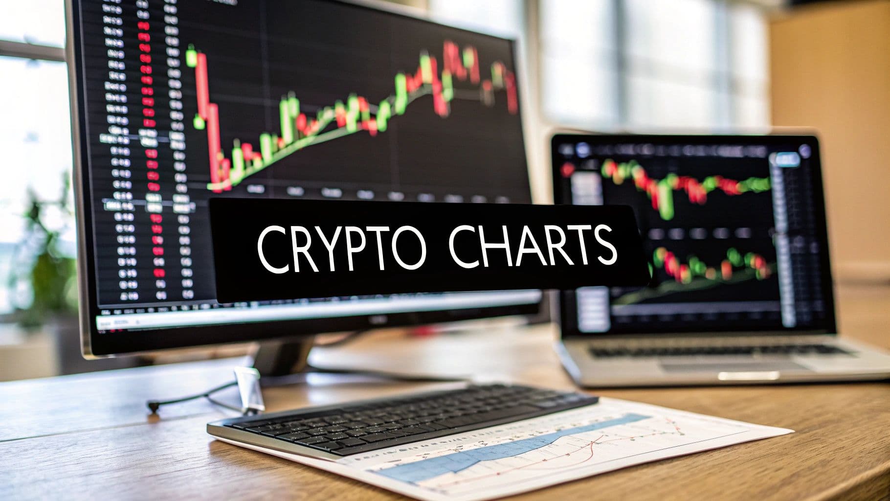
Your First Look at a Crypto Chart
Staring at a crypto chart for the first time can be intimidating. It often looks like a chaotic mess of colored bars, jagged lines, and flashing numbers. But trust me, once you learn to decipher its basic components, you’ll realize it's just telling you about the constant tug-of-war between buyers and sellers.
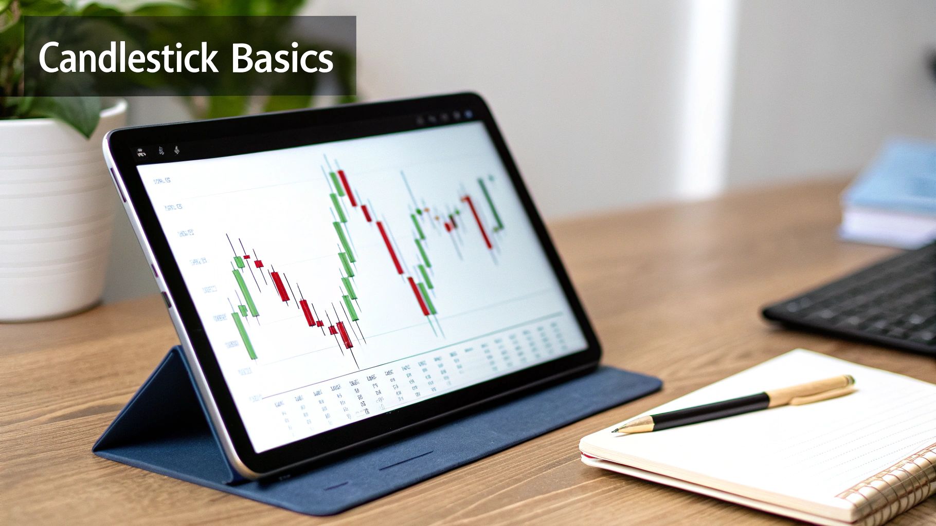
The absolute best place to start is with the candlestick. Each one is a snapshot of all the price action that happened within a specific time frame, whether that's one minute, one hour, or a full day.
Anatomy of a Candlestick Chart
To help you get your bearings, here's a quick reference guide to the key elements you'll see on any standard crypto chart. Think of this as your cheat sheet for understanding the language of the market.
| Chart Element | What It Shows | Why It Matters |
|---|---|---|
| The Body | The range between the opening and closing price for the period. | A green body shows the price closed higher than it opened (bullish). A red body means it closed lower (bearish). |
| The Wicks | The highest and lowest prices reached during that period. | Long wicks signal high volatility and indecision in the market. |
| Time Frame | The duration each candlestick represents (e.g., 1M, 5M, 1H, 1D). | Shorter time frames show short-term volatility; longer ones reveal the bigger trend. |
| Volume Bars | The total amount of the asset traded during the period. | High volume confirms the strength of a price move, while low volume suggests weakness. |
Understanding these four components is the foundation of technical analysis. Everything else you learn will build upon this knowledge.
Decoding a Candlestick
The real magic of reading a chart comes from understanding what each part of a single candlestick is telling you. They manage to pack a huge amount of information into one small shape.
The Body: This is the thick, rectangular part. Its color and size are your first clues. A green body means the closing price was higher than the opening price—a win for the buyers. A red body means the closing price was lower—a win for the sellers.
The Wicks (or Shadows): These are the thin lines that stick out from the top and bottom. They show you the absolute highest and lowest prices the asset hit during that time frame, painting a picture of the session's full price range and volatility.
Take a look at a typical candlestick chart you'd find on a platform like TradingView.
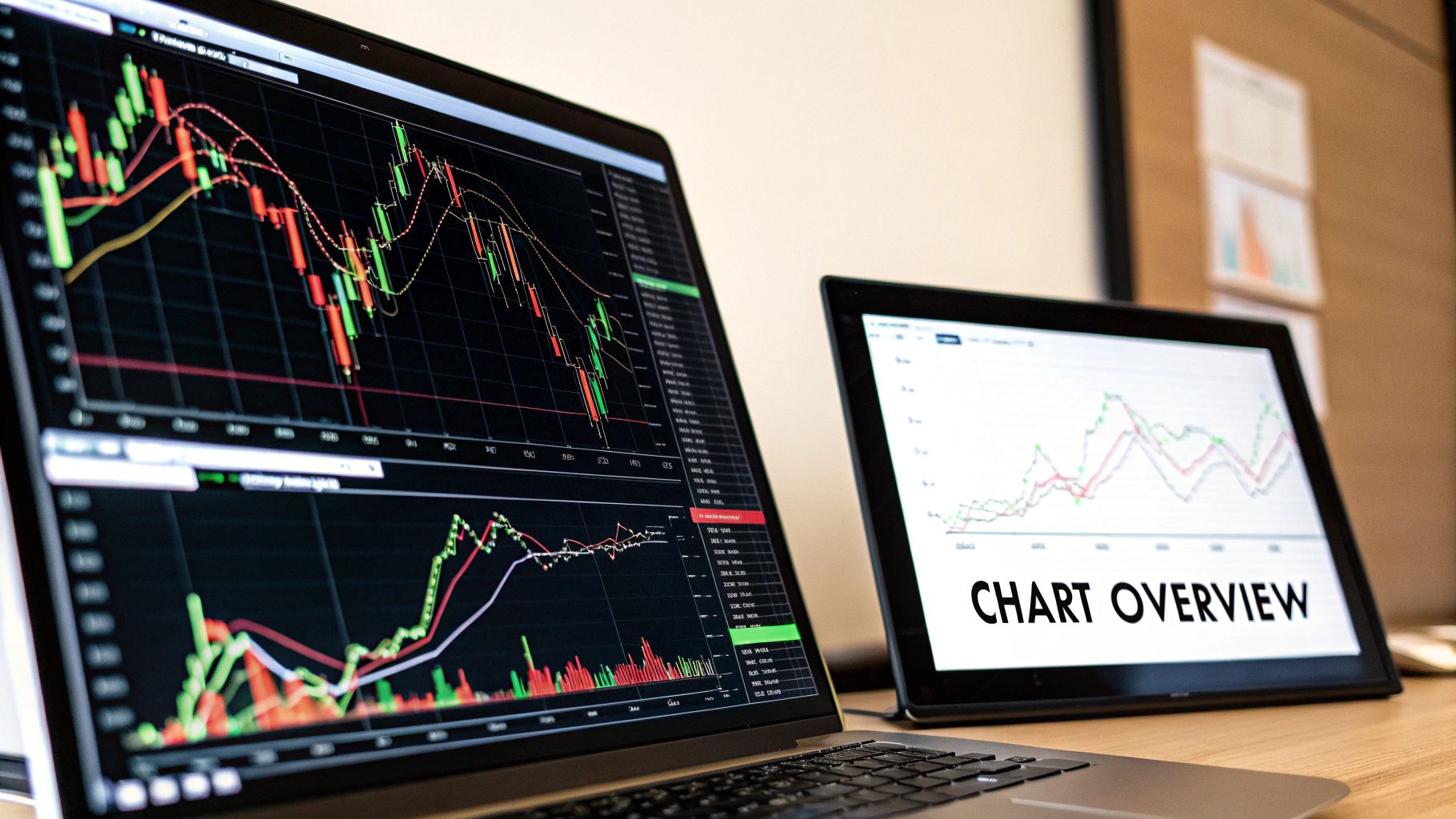
In this image, you can clearly see how the green candles signal upward momentum while the red ones indicate selling pressure. Notice the volume bars at the bottom, which we'll get to next.
Why Volume Is So Important
Look just below the main price action, and you'll almost always see another set of vertical bars. That’s your trading volume. It shows you exactly how much of a crypto asset was bought and sold during each period. This isn't just extra data; it's a critical piece of the puzzle.
A price move on high volume has conviction. Think of it as a statement being shouted from the rooftops. A move on low volume is more like a whisper; it's uncertain and could easily fizzle out or reverse.
When you see a strong price trend backed by heavy trading volume, that's confirmation. For example, a big jump in price accompanied by a massive spike in volume tells you there’s strong buying pressure fueling the move.
If you're just starting out, getting these fundamentals down is your first big step. The principles of chart analysis are pretty universal, so if you want to build a solid foundation, check out a complete guide on how to read stock charts for beginner investors, as many of the core concepts apply directly to crypto.
Choosing the Right Chart for Your Analysis
While candlestick charts are the go-to for most traders—and for good reason—they aren't the only game in town. The chart you use can completely change what you see in the market. Knowing when to switch views is a skill that separates seasoned traders from the rest.
It really boils down to what you're trying to accomplish. Are you just trying to get a quick pulse on the market, or are you diving deep into the nitty-gritty of price action?
For a simple, high-level view, nothing beats the classic Line Chart. It cuts through all the daily volatility by connecting the closing prices over a set period. This gives you a clean, unobstructed look at the primary trend. If you just need a quick answer to "Did Bitcoin go up or down last month?" a line chart is your best friend.
But if you're a day trader or need to spot specific patterns, you need more information. That's where candlestick charts shine, showing you the open, high, low, and close prices for every single period.
Beyond the Basics: Heikin-Ashi and Renko Charts
Once you’ve got a handle on candlesticks, you can start exploring some more specialized charts. Think of these as advanced tools that can give you a unique edge by filtering the market in different ways. Two of my favorites are Heikin-Ashi and Renko charts.
Heikin-Ashi Charts: The name means "average bar" in Japanese, which is a perfect description. These charts smooth out price action by using a modified formula based on two-period averages. The goal is to filter out minor, misleading price wiggles and false signals. What you get is a chart with long, clean strings of green or red candles that make powerful trends pop off the screen.
Renko Charts: This one is really interesting because it completely ignores time and focuses only on price movement. Renko charts are built with price "bricks" of a size you determine. A new brick only gets drawn when the price moves a specific amount, up or down. This erases all the sideways "noise" when the market is going nowhere, making it incredibly effective for pinpointing major support and resistance levels.
Pro Tip: I like to think of chart types like different camera lenses. A line chart is your wide-angle shot—great for the big picture. Candlesticks are your standard lens for everyday detail. Heikin-Ashi acts like a polarizing filter to reduce glare, while Renko is a macro lens, letting you zoom in on only the most significant price moves.
Learning to switch between these views can give you a much richer understanding of the market. For instance, if I spot what looks like a trend reversal on a candlestick chart, I'll often flip over to a Heikin-Ashi chart to see if the momentum is truly shifting. Using multiple charts this way is a fantastic method for building confidence before you place a trade.
Using Technical Indicators to Uncover Market Trends
Alright, once you've got a handle on reading candlesticks and spotting volume spikes, it's time to layer in some more advanced tools: technical indicators. Think of them as special calculators that run on raw price and volume data. They help you look past the day-to-day noise to see the bigger picture—things like momentum, trend strength, and potential reversals.
Indicators help answer the questions every trader asks: "Is this upward move for real, or is it running out of steam?" or "Is this coin getting cheap enough to buy the dip?"
You'll find hundreds of indicators out there, but don't get overwhelmed. Most experienced traders I know stick to a small, trusted toolkit. The goal isn’t to plaster your chart with a dozen confusing lines, but to really understand how a few powerful ones work in tandem to tell a story.
Smoothing Price Action with Moving Averages
The Moving Average (MA) is almost always the first indicator people learn, and for good reason. It’s simple, visual, and incredibly useful for cutting through the clutter of daily price swings to see the underlying trend. It does this by plotting a single, flowing line that represents the average price over a set period.
You’ll mainly work with two types:
- Simple Moving Average (SMA): This is the classic. It takes the closing prices for a certain number of periods (say, 50 days), adds them up, and divides by 50. It’s a straightforward average where every day in the period has the same importance.
- Exponential Moving Average (EMA): This one is a bit more responsive. The EMA gives more weight to the most recent price action, so it reacts quicker to sudden moves. Because of this, many short-term traders and I tend to favor it.
A really common strategy is to watch how the price interacts with these moving averages, which often act as dynamic support or resistance levels. In a healthy uptrend, it's typical to see the price pull back to an MA line, find buyers waiting there, and then bounce right off it to continue its climb.
For example, during a strong bull market, I keep a close eye on the 21-period EMA on the daily chart. If Bitcoin's price dips and "kisses" that line before bouncing higher, it’s a powerful confirmation for me that the bulls are still in control.
Measuring Momentum with the Relative Strength Index
Moving averages are great for identifying the direction of a trend, but the Relative Strength Index (RSI) tells you about its strength and momentum. The RSI is an oscillator, which is just a fancy way of saying it’s an indicator that moves back and forth between two extremes—in this case, 0 and 100.
It essentially measures how fast and how far prices have moved, letting you know if an asset might be overbought or oversold.
Here’s the standard interpretation:
- Overbought (RSI above 70): This suggests buying pressure might be getting exhausted. The price has moved up very quickly, and the asset could be due for a cooldown or a pullback.
- Oversold (RSI below 30): This signals the opposite. Selling has been aggressive, and the move down might be running out of gas, potentially setting up a bounce.
Now, a critical point: an RSI reading above 70 is not an automatic sell signal! A powerful asset can stay overbought for weeks in a strong bull market. The real magic of the RSI is in spotting divergence. This is when the price pushes to a new high, but the RSI chart fails to do the same, making a lower high instead. That's a classic warning sign that the underlying momentum is fading.
Gauging Volatility with Bollinger Bands
Last but not least, let's talk about Bollinger Bands. This indicator gives you a sense of an asset's volatility. It’s made up of three lines plotted over the price chart: a middle band (which is just an SMA), plus an upper and lower band that represent a statistical measure called standard deviation.
These outer bands are dynamic—they expand when the market is volatile and contract when things get quiet.
- Wide Bands: Volatility is high; expect big price swings.
- Narrow Bands (a "squeeze"): Volatility is low. This is often the calm before the storm, signaling that a big, decisive price move could be just around the corner.
Traders use Bollinger Bands to spot potential tops and bottoms. When the price hits the upper band, it’s considered potentially overextended to the upside. When it tags the lower band, it might be oversold and ready for a bounce.
By combining these three—MAs for the trend, RSI for momentum, and Bollinger Bands for volatility—you start to build a much more complete and robust picture of what’s happening on the chart.
Recognizing Powerful Chart Patterns
Once you have a feel for individual indicators, the next step is to start seeing the bigger picture. This is where chart patterns come in. Think of them as recurring formations made by price movements that can give you a solid clue about where the market is headed.
History doesn't repeat itself perfectly in the markets, but it often rhymes. Learning to spot these patterns is one of the most valuable skills you can develop. You’re not just looking at lines on a screen; you're seeing the story of a battle between buyers and sellers—a visual representation of greed, fear, and indecision.
Continuation Patterns: When the Trend Is Your Friend
Some of the most straightforward patterns are the ones that suggest a trend is just taking a breather. These are known as continuation patterns, and they can be a great signal to jump into an existing trend that still has room to run.
Two of the most common ones you'll see are Bullish and Bearish Flags:
- Bullish Flag: You'll spot this during a strong uptrend. It kicks off with a sharp, almost vertical price surge (the "flagpole"), followed by a brief period of slight downward drift (the "flag"). This consolidation shows that while some traders are taking profits, the underlying buying pressure is strong and likely to push the price higher again.
- Bearish Flag: This is the exact opposite. It forms in a downtrend after a steep price drop (the flagpole). A short period of upward consolidation (the flag) follows before the price typically breaks down again, continuing the bearish move.
These patterns are powerful because they represent a pause, not a full-stop reversal. It’s like the market is catching its breath before the next major move. You can learn more about the assets driving these price moves in our guide on what is a cryptocurrency token.
Reversal Patterns: Spotting the Turning Tide
While continuation patterns tell you the party is likely to continue, reversal patterns are the warning signs that the trend is running out of gas and might be about to flip. Catching these early can be the key to protecting your gains or positioning yourself for a brand-new opportunity.
Perhaps the most famous reversal pattern is the Head and Shoulders. It typically forms at the peak of an uptrend and looks just like it sounds: a central, higher peak (the "head") with two lower peaks on either side (the "shoulders"). This structure shows that buyers made three attempts to push the price to new highs, but each attempt had less and less conviction, signaling a potential shift to a downtrend.
Another critical reversal pattern to watch for is the Double Top or Double Bottom.
A Double Top looks like the letter "M." It happens when the price hits a key resistance level twice but fails to break through. That failure is a huge tell—it shows that buyers just don't have the strength to push prices higher, often leading to a sharp reversal. A Double Bottom, shaped like a "W," is its bullish twin, signaling a potential trend change after the price successfully holds a support level twice.
Always look for confirmation. A true breakout or breakdown from one of these patterns is almost always accompanied by a significant spike in trading volume. Combining pattern recognition with volume and indicators like the RSI is a classic technique that experienced traders use to increase their confidence in a trade.
Building a Practical Analysis Framework
Knowing the tools of the trade—like patterns and indicators—is one thing. But the real skill comes from weaving them together into a coherent strategy that actually works. Think of it as building a framework that lets you approach any chart systematically, moving from a bird's-eye view down to the nitty-gritty details without getting lost in the noise. It’s all about building a trading thesis based on confluence, which is just a fancy way of saying multiple, independent signals are all pointing in the same direction.
This process is your defense against making impulsive decisions. For instance, just seeing an "oversold" signal on the RSI isn't enough to jump into a trade. That’s a rookie mistake. But what if you see an oversold RSI and the price is bouncing perfectly off a major support level and a bullish candlestick pattern forms right at that moment? Now you’re talking. That’s a much stronger, data-backed reason to consider an entry.
Start with a Multi-Timeframe Analysis
The single most effective habit you can build is starting wide and then zooming in. This technique is called multi-timeframe analysis, and it’s a game-changer. You always begin with a higher timeframe, like the daily (1D) or even the weekly (1W) chart, to figure out the primary market trend. This is your big-picture context. Is the asset in a clear uptrend, a downtrend, or just chopping sideways?
Once you have that macro view locked in, then you can drill down to a lower timeframe, like the 4-hour (4H) or 1-hour (1H) chart. This is where you hunt for your specific entry and exit points that align with the major trend you already identified. A bullish signal on a 4H chart is infinitely more reliable if the daily chart is also showing a strong, established uptrend.
Key Takeaway: Always trade with the dominant trend you see on the higher timeframe. Fighting a powerful daily trend to catch a tiny reversal is a high-risk, low-reward game that usually ends in tears.
Putting It All Together: A Real-World Example
Let's walk through a scenario. You're looking at a popular altcoin and you pull up the daily chart. You immediately notice it's been in a steady uptrend for weeks, consistently finding support at its 50-day moving average. That’s your primary bullish thesis right there.
Now, you zoom into the 4-hour chart to time your entry. You see the price has just pulled back to touch that same 50-day MA. As you watch, a few things happen almost at once:
- Candlesticks: A powerful bullish engulfing candle forms right on the moving average line.
- Volume: You notice the trading volume on that bullish candle is significantly higher than the last few, confirming that buyers are stepping in with conviction.
- Indicators: The RSI on this 4-hour chart is just beginning to climb out of oversold territory, crossing back above 30.
This is a textbook example of confluence. The macro trend, the support level, the candlestick pattern, the volume spike, and the momentum indicator are all singing the same tune. This structured approach gives you a practical checklist for building a solid trading plan. It's this kind of data-driven thinking that many businesses use to manage their crypto assets; you can see how this plays out in our guide on how to accept crypto payments for your business.
This kind of analysis often hinges on understanding core concepts like moving averages.
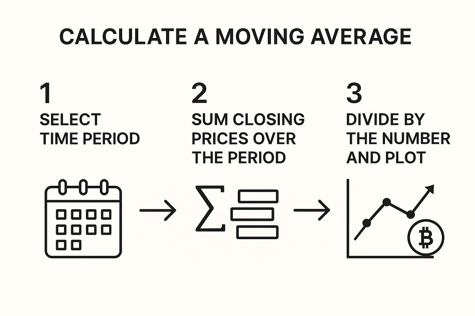
Visuals like this help simplify the math, reminding us that indicators are simply different ways to interpret an asset's price action over time.
The way we analyze these charts has evolved right alongside the crypto market itself. By March 2025, the total cryptocurrency market cap was already fluctuating around $4 trillion. Experienced traders today don't just look at price and volume; they incorporate on-chain data like network transaction counts and daily active addresses—which for Bitcoin has hit millions in recent years. This shows just how much reading crypto charts has grown from simple line-watching into a sophisticated, data-rich discipline.
Common Questions About Reading Crypto Charts
Even after you've got a handle on the basics, a few questions always seem to pop up. It's completely normal. Let's walk through some of the most common sticking points I see with new traders. Clearing these up will help you build confidence and start analyzing the markets on your own.
Think of this as your final check-in before you dive in. Getting these questions answered is what bridges the gap between theory and the real-world application of reading crypto charts—where actual money is at stake.
What Is the Best Timeframe to Use?
This is probably the number one question I get asked. Everyone wants to know the "best" timeframe, but the truth is, it doesn't exist. The right timeframe for you depends entirely on your trading style and what you're trying to achieve.
- Long-term investors looking for major market shifts will probably find themselves on the daily (1D) or weekly (1W) charts. They're focused on the big picture and aren't bothered by small, daily price swings.
- Day traders, on the other hand, live in the short term. They might use the 1-hour (1H) or even 15-minute (15M) charts to find quick opportunities for getting in and out of a trade within the same day.
My best advice? Use multiple timeframes together. I always start with a high timeframe, like the daily chart, to get a sense of the primary trend. Then, I'll zoom in to something like the 4-hour or 1-hour chart to pinpoint a good entry point.
How Reliable Are Chart Patterns?
It’s crucial to understand that chart patterns are about probabilities, not certainties. Think of them as signposts, not guarantees. A classic Head and Shoulders or a Double Bottom pattern gets its reputation because it reflects predictable human psychology in the market, but they can—and do—fail.
So, how do you increase your odds? You look for confirmation. A bullish pattern becomes much more compelling if you see it forming with a big spike in trading volume. Or maybe you get a matching buy signal from an indicator like the RSI.
Never, ever trade on a pattern alone. Always wait for that confluence of signals to back up your decision.
Can I Trade Using Only Chart Analysis?
Absolutely. Plenty of successful traders build their entire strategy around technical analysis—the art of reading charts. By focusing purely on price action and market data, you can develop a very effective approach.
However, I've found it's always smart to keep an eye on fundamental factors, even if you're a die-hard chartist.
Major news, like a regulatory crackdown or a game-changing project update, can send prices flying in a way that technicals alone simply can't predict. Even understanding the basics of how businesses are using crypto can give you an edge. If you're curious about that, you can learn more by demystifying crypto processing in this simple guide. At the end of the day, blending both technical and fundamental awareness will almost always lead to better, more informed decisions.
Ready to put what you've learned into practice? BlockBee provides a secure, efficient platform for businesses to manage their crypto transactions. We support over 70 cryptocurrencies and offer a simple API to make accepting crypto payments a breeze. Get started with BlockBee today!